Case study banner

Colorful Conversions: How Show Me Your Mumu Boosted AOV by 20% with Nosto’s Product Recommendations

About Show Me Your Mumu

Show Me Your Mumu is a clothing brand that is passionate about bringing customers quality pieces made with care and never mass produced. Notably, they are committed to empowering women, with over 80% of their workforce being female. They aim to foster a special connection with all of their customers, regardless of age, by remaining both approachable and real. 

The Mumu motto is “life is fun, your clothes should be too!”

The Challenge

As Show Me Your Mumu’s customer base continued to grow and they expanded their presence in the bridal market, they recognized that product recommendations were going to play a pivotal role in not only attracting new audiences, but retaining customers at every stage of the lifecycle journey.

Central to Show Me Your Mumu’s brand loyalty strategy is the emphasis on quality over quantity. Their focus on enhancing personalization and improving product discovery across their website is designed to cater to shoppers searching for clothing and accessories for significant life events, all the while nurturing and strengthening customer loyalty. “For our bridal line, we get a lot of requests for specific color recommendations and swatches,” says Hannah Sudbey, E-commerce Analyst at Show Me Your Mumu.

With the influx of detailed requests related to specific clothing colors and accessories, the team found themselves investing a significant amount of time into manually merchandising product recommendations and as a result, were lacking the time and resources to track recommendation performance, conduct A/B testing and optimize product recommendation placement across the site.

 

The Solution

Given the demand for color-specific products, Show Me Your Mumu implemented a range of color-focused strategies across the “Shop Weddings” area of their site.

Color-Swatch Selector: They introduced a color-swatch selector within their product recommendations, simplifying the process for shoppers to explore various styles and colors of bridesmaid dresses effortlessly without having to leave the currently viewed page.

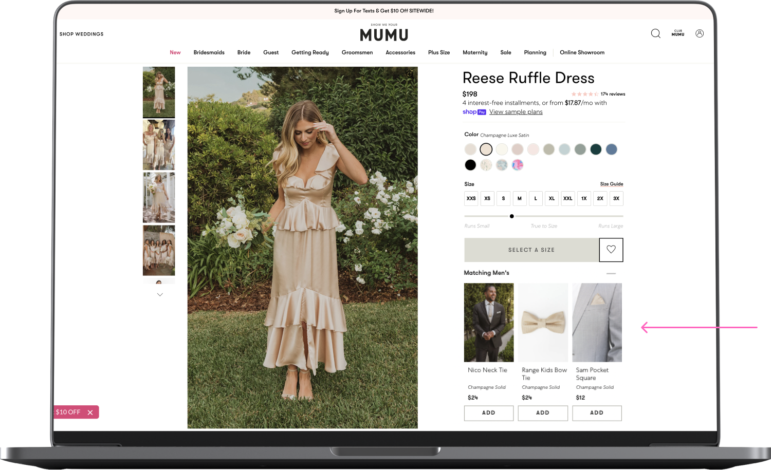
Matching Men’s Accessories: The team creatively incorporated product recommendations and selected logic that perfectly matches bridesmaid dress color to men’s ties and accessories. This enables shoppers to curate the entire wedding party ensemble all while aiming to boost AOV.

“We created a new placement to promote our matching men’s ties to keep this offering top of mind for shoppers looking at bridesmaids dresses. We found a creative solution through Nosto to continue to move through that product offering.”

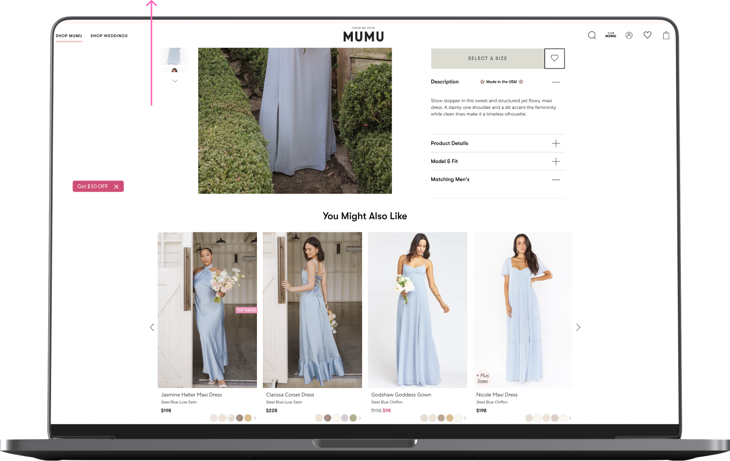
You Might Also Like” Recommendations: Additionally, they added a “You May Also Like” personalized product recommendation to the wedding line PDPs, offering shoppers alternative styles in the same color-way as the currently-viewed product.

These strategies not only provide shoppers with alternative and complementary product suggestions within the same color range but also seamlessly adapt as users switch between different color options. The versatility of Nosto’s product recommendation design has played a pivotal role in elevating the overall user experience by catering to a heightened interest in color matching.

To further foster brand loyalty and enhance product discovery once shoppers have left the site, Show Me Your Mumu also integrated Nosto’s personalized email recommendations into their email marketing strategy. By combining Nosto’s email widgets with Klaviyo, the brand curated custom emails based on browsing history and product affinity, seamlessly integrating them into site abandonment flows. This dynamic collaboration resulted in a remarkable 70% average open rate and a significant increase in click-through rates within just six months.

Since we have such a vast variety of products that we offer, it is hard to choose what to show customers. When using a personalized recommendation, it takes out some of the guessing game of what each customer is interested in.

Hannah Sudbey, Ecommerce Analyst

The Results

Since implementing product recommendations and email widgets, Show Me Your Mumu has seen impressive results in the past six months. Their average order value (AOV) increased by nearly 20%, and their email widget click-through rate by 4%.

Additionally, the team has experienced significant gains in efficiency and creativity.

“Our team values the versatility of Nosto’s capabilities, allowing us to continually elevate our strategies. Whether it’s leveraging segments and content personalization during promotions or refining product recommendation logic, we have numerous ways to enhance our customers’ site experience.”

With the continued success of the wedding line driven by product recommendations and email widgets, Show Me Your Mumu remains committed to optimizing the website experience and streamlining the shopper journey to cultivate an even larger community of loyal customers.

“We embrace Nosto’s creative potential. It empowers our team to explore new avenues, gather valuable metrics, and test ideas that tailor the customer experience on our site.”

Results figure

Other case studies

How Casio streamlines product discovery & encourages shoppers to buy direct

Read more
How JOTT doubled conversions by improving its product discovery journey on Shopify

Read more
PELAGIC’s Journey to Increased Sales & Engagement through Nosto’s CX Optimization Services

Read more
Chelsea Peers doubles category page conversions by personalizing to curve and maternity shoppers

Read more