43 Product Recommendation Examples That Transform the Ecommerce Experience
Use these product recommendation examples to inspire your ecommerce store and email marketing strategies to increase relevance and revenue.
Personalized product recommendations are an integral part of any successful retailer’s ecommerce strategy, helping customers discover products that are most relevant to their interests and reduce barriers to purchase.
But that’s not all they’re meant to do.
When used efficiently, product recommendations can completely transform customer interactions, creating a fluid and consistent experience that leads to more conversions, higher order value, and an overall greater trust in your brand.
Explore these product recommendation examples you can use across your ecommerce store and email marketing efforts.
1. Homepage
Why the homepage? While not always the first touchpoint for shoppers, the homepage is still considered an important welcoming point for first-time visitors who know little about your brand (and, similarly, a place for you to learn more about them as they interact with your site). This welcome experience is the key to capturing attention and should be relevant to the different shoppers, channels, and entry points to the site.
New visitors are obviously more of a challenge to gauge since you’ve yet to collect any behavioral data from them. In this case, product recommendations best practices call for highlighting items with the highest conversion rates (i.e. top sellers).
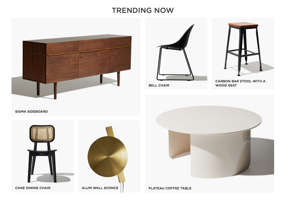
To welcome new visitors, Industry West’s homepage uses crowd logic, ‘Best seller’ and ‘Trending now’ content to inspire and guide them to learn more about the brand and their most popular items. An example of this is their ‘Trending Now’ recommendations:
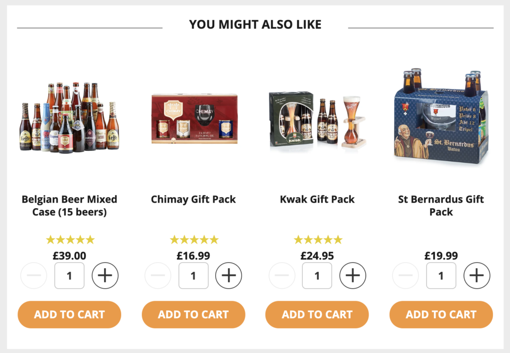
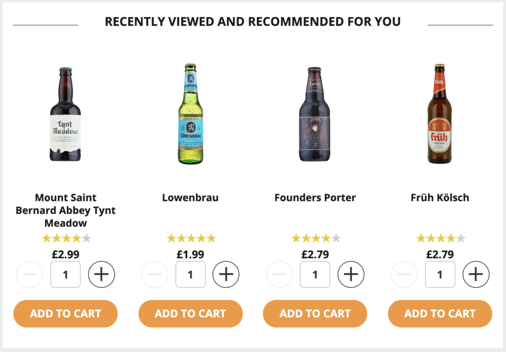
Beer Hawk features homepage product recommendations that include customer ratings to drive interest through social proof:
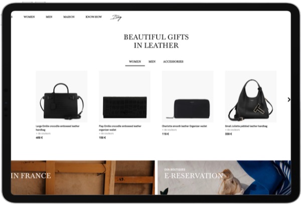
French fashion brand Le Tanneur displays best-seller recommendations divided by category: women’s, men’s, or accessories
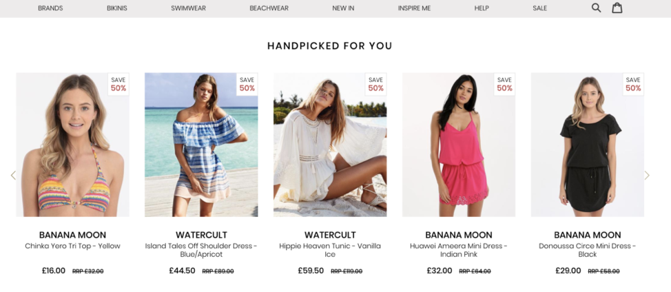
Beauty giant Sephora features a ‘new’ tag above new product arrivals:

LeSportSac displays best-seller recommendations as ‘Fan Favorites’ on their homepage – a tactic that contributed to a 2.4x increase in conversion:
As we know, shoppers are highly susceptible to influence from their peers (one of the many truths in the psychology of ecommerce). The items that other shoppers are browsing and purchasing are desirable and so, recommendations that hint at what other visitors are also interested in have proven to increase conversion and click-through rate.
Below you can see an example of how Prime Loops have done just that by sharing insights into what music samples other users are interested in:

2. Product Detail Pages
Why product detail pages? Visitors who land on a product page are still searching for something to buy. While they browse, offer relevant alternatives and complementary products that pique their interest – otherwise known as up-selling and cross-selling, respectively.
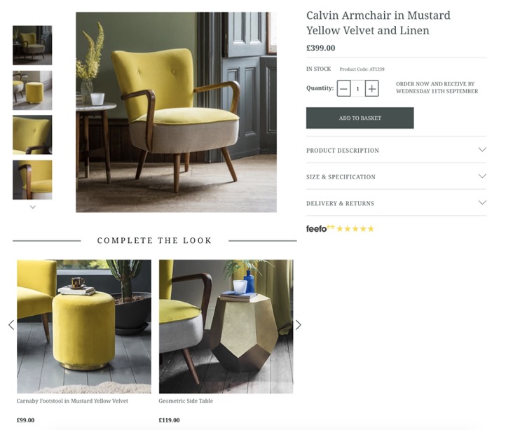
Atkin & Thyme encourages customers to ‘complete the look’ using product bundles, which has helped increase average order value by 6.5%:
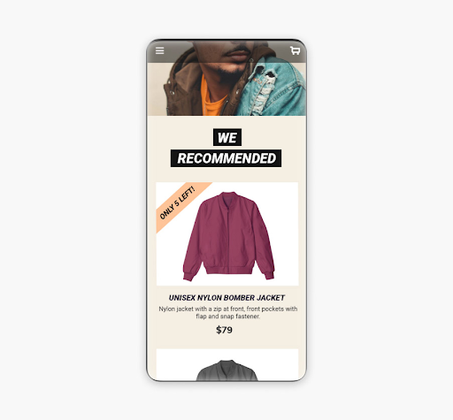
A clever way to catch the shopper’s eye with product page recommendations is to display a ‘FOMO’ ribbon to show the product will soon be out of stock:
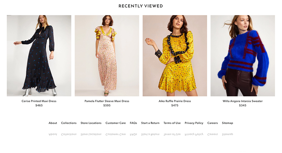
Cynthia Rowley keeps previously browsed products in front of the shopper by displaying ‘recently viewed’ recommendations:
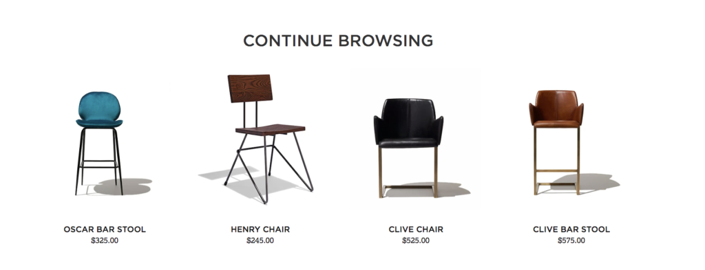
Industry West encourages visitors to continue browsing once they’ve viewed a particular product:
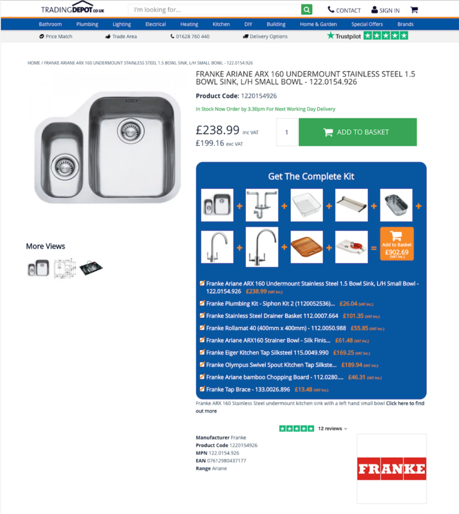
Online electrical wholesaler Trading Depot sells many products that act as components of larger systems. Instead of focusing on similar products, they upsell their shoppers with relevant product recommendations that they’d likely buy anyway:
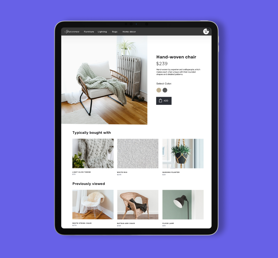
Combine 2 product recommendation blocks on product detail pages to maximize the experience. In this example, products that typically bought with the one currently viewed are shown above products that the customer has previously browsed:
Here’s another example of this tactic for the sportswear industry:
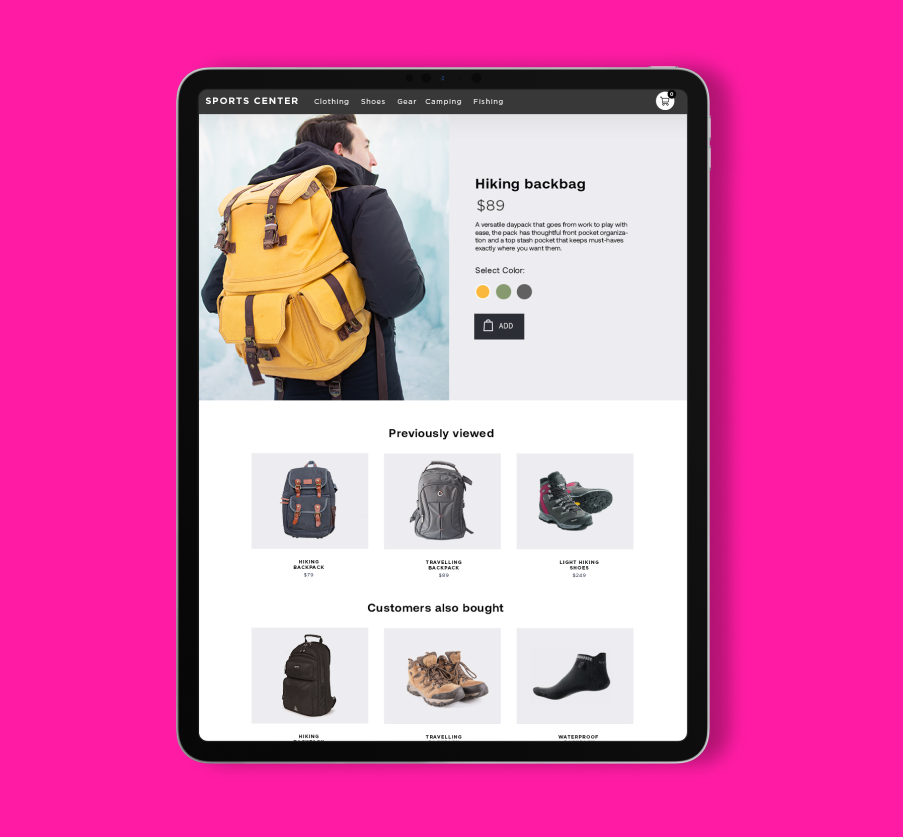
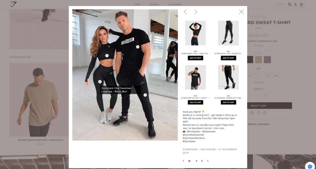
Image ribbons on pages can launch a shoppable user-generated content banner, as seen here on Gymshark’s product page:
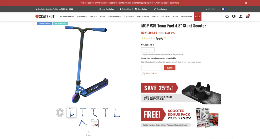
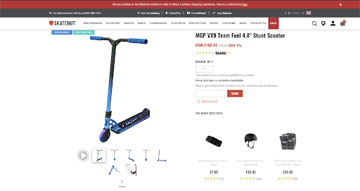
SkateHut AB tests similar, but varied, promotions for scooters on their product pages that depend on what the shopper is browsing in order to increase average order value:
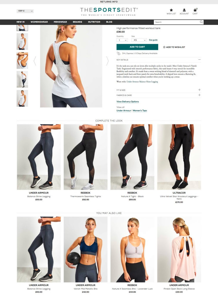
The Sports Edit and their merchandisers know that some ranges are always a perfect match for each other. By tagging ranges such as “workout tops” and “tights” together, they ensure that key inventories are always matched:
3. Search Pages
Anticipating what your customer is searching for is the cherry on the sundae of personalized shopping. The ideal search page incorporates intelligent recommendations–items that other customers have viewed and purchased to guide customers along their journey. The fun part? Intelligent recommendations are also grammar gurus and can spot incorrect search terms, instead displaying items similar to that term. For maximum ease-of-use, search recommendations should be displayed above the fold so customers can easily find what they’re searching for.
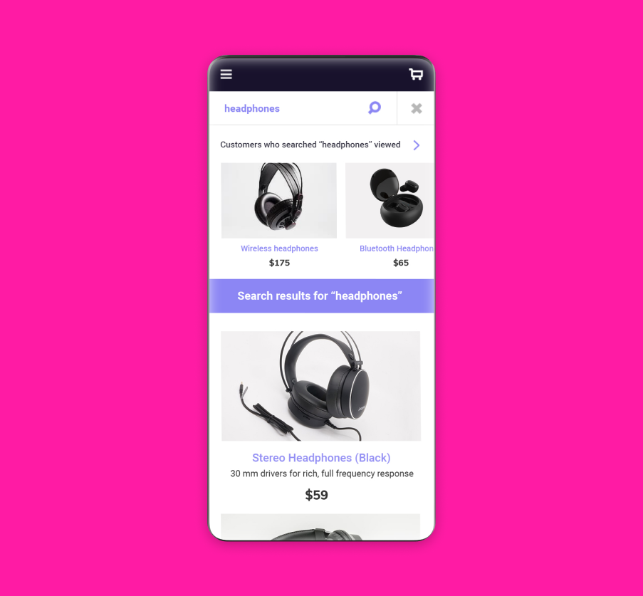
In this example, product recommendations are shown complementary to the search term ‘headphones’:
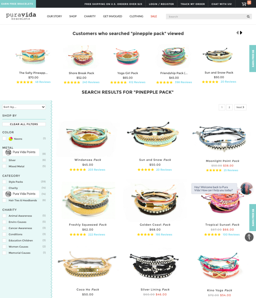
Puravida’s search page recommendations are displayed at the top of the page, also including product ratings to drive more interest:
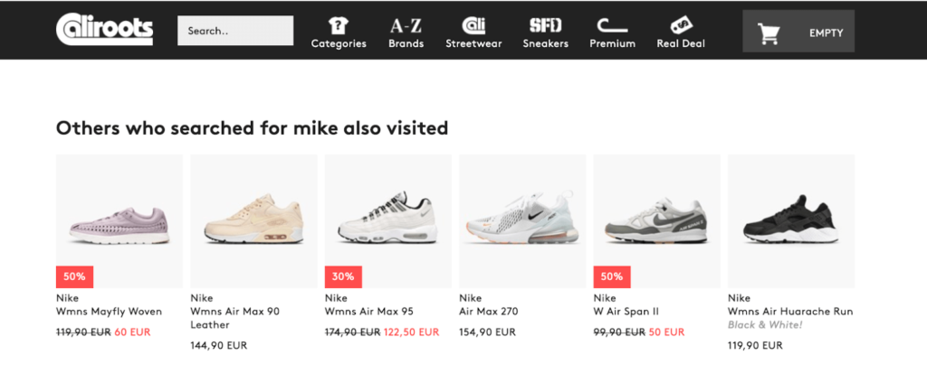
Stockholm-based streetwear store Caliroots’ search engine showcases contextually relevant products; for example, an in-store search with the keyword “Mike” presents skateboards done in collaboration with Kodak Mike Carroll and Kodak Mikemo.
The behavioral “Search and Viewed” recommendation element below the actual search results reveals that users who searched for ‘Mike’ ended up viewing ‘Nike’ sneakers:
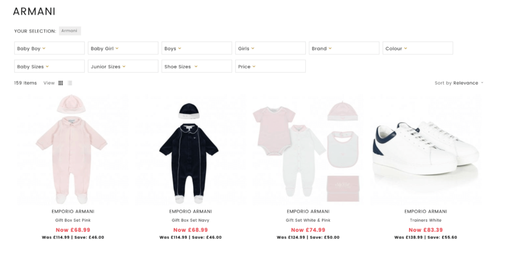
On award-winning UK retailer Designer Childrenswear’s search page, Armani is heavily represented on the site. Upon searching for “Armani”, a shopper gets redirected to the brand page with the relevant faceting options to further narrow down the selection:
4. Category Pages
Category pages are one of the most important drivers of discovery in an online store. They store all of the relevant products and expose them on a dedicated page, allowing the shopper to narrow down to a particular subcategory to find exactly what they are looking for.
The WOD Life use product recommendations on their category page to help visitors easily find popular products in a specific category. To do so, they added a product recommendation block ‘Most popular in this category’ at the bottom of the category page.

Utsav Fashion uses a combination of Browsing History Related and Best Sellers coupled with a ‘Current category’ filter:
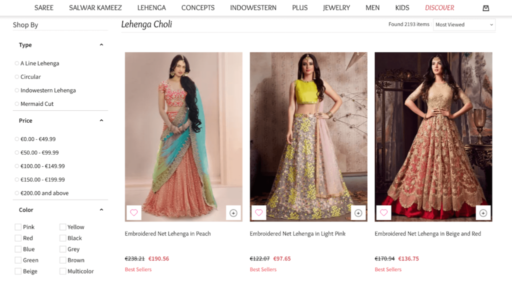
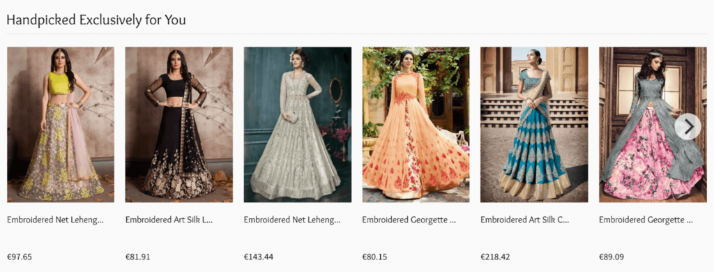
When visiting the Lehenga ‘Choli’ category, there are 2,193 products to choose from. However, by leveraging a Best Seller product recommendation with a ‘Current Category’ filter, we can narrow this down to the six most popular items:
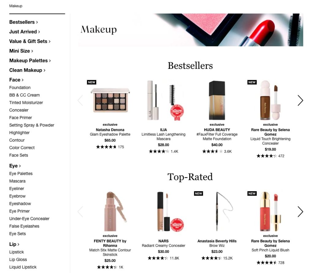
Sephora leverages product recommendations on category pages by showcasing best-sellers and top-rated products:
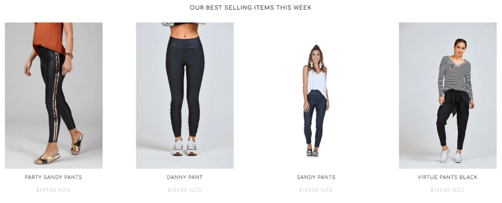
New Zealand fashion house Augustine showcases a top-level category for bottoms, which includes skirts, shorts, pants, and a similar setup of Browsing History related recommendations (with a fallback to Best-seller recommendations if the shopper is a first-time visitor):
5. Shopping Cart Page
Why the cart page? This page is prime time for up-selling. It’s the perfect moment to offer complimentary items to complete a customer’s purchase. Add in some product recommendations on this page to remind your customer about the most relevant items browsed. Fun fact: up to 25% of customers who click on these recommendations actually order the item (just make sure to exclude items already in their cart).
Free shipping incentives are also an effective way to push product recommendations. And, if you offer free delivery above a certain spend value, it helps customers reach that minimum value by offering products to add to their cart. This will surely up your customer service game.
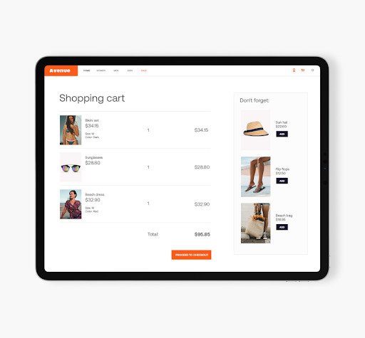
One way to drive additional purchases is to display ‘Don’t forget’ recommendations at the end of their journey that create a last-minute up-sell opportunity:
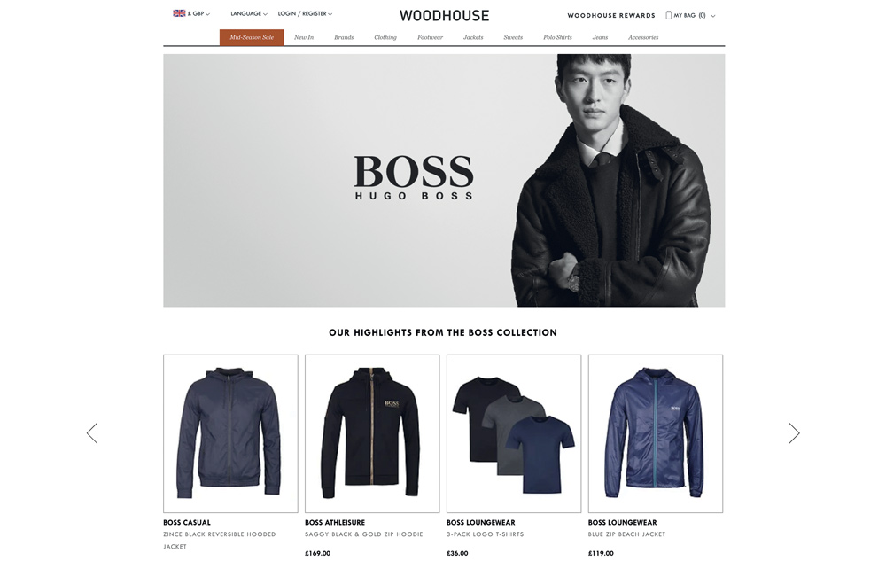
Personalized recommendations were added to Woodhouse Clothing‘s cart page to remind customers of the items that the shopper showed interest in but not yet added to cart. This has contributed to a 44% increase in conversion for the brand:
The Beer Hawk team set up an A/B test to measure how recommendations are tied to actual customer behavior on their cart page:
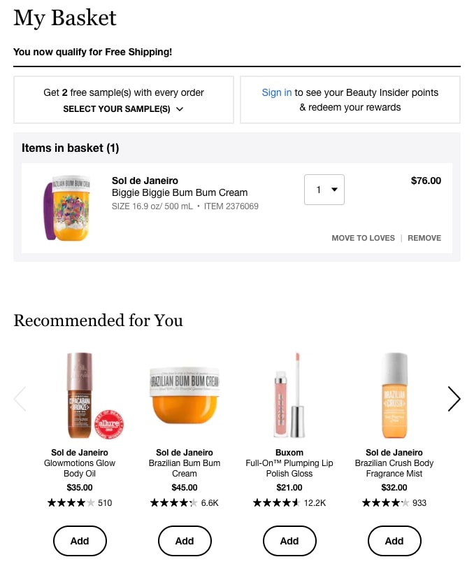
Sephora uses product recommendations on their checkout page to trigger up-sell opportunities:
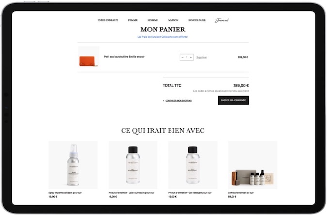
Le Tanneur displays items often bought with the items currently in a shopper’s cart on the cart page. These recommendations give shoppers one last chance to add complementary items to their cart and naturally drive average order value up.
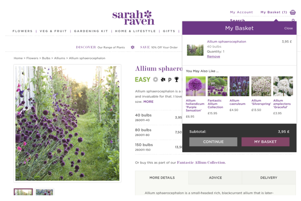
Sarah Raven displays how visitors can naturally continue their shopping journeys through recommendations once they have added something to the shopping cart:
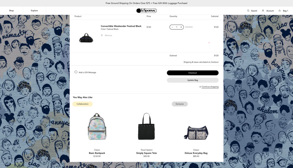
Shopping cart recommendations by LeSportsac include ‘collaboration’ and ‘exclusive’ tags to improve click-through rate:
6. Checkout Page
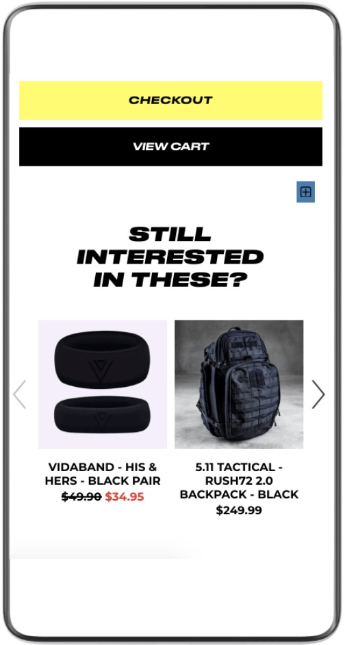
To increase AOV at the end of the purchase journey, The WOD Life integrated a product recommendation block ‘Still interested in these’ into their mini cart, showing the visitor’s browsing history.
7. 404 Pages
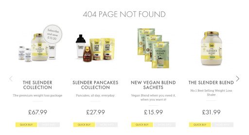
Turn a dead end into a key part of your product recommendation strategy by leading a shopper back into product detail pages that are of interest to them. Using ‘previously viewed’ and ‘popular items’ recommendations on your 404 page can help turn a bad experience into one of discovery.
404 page recommendations can be as simple as the ones in the example below:
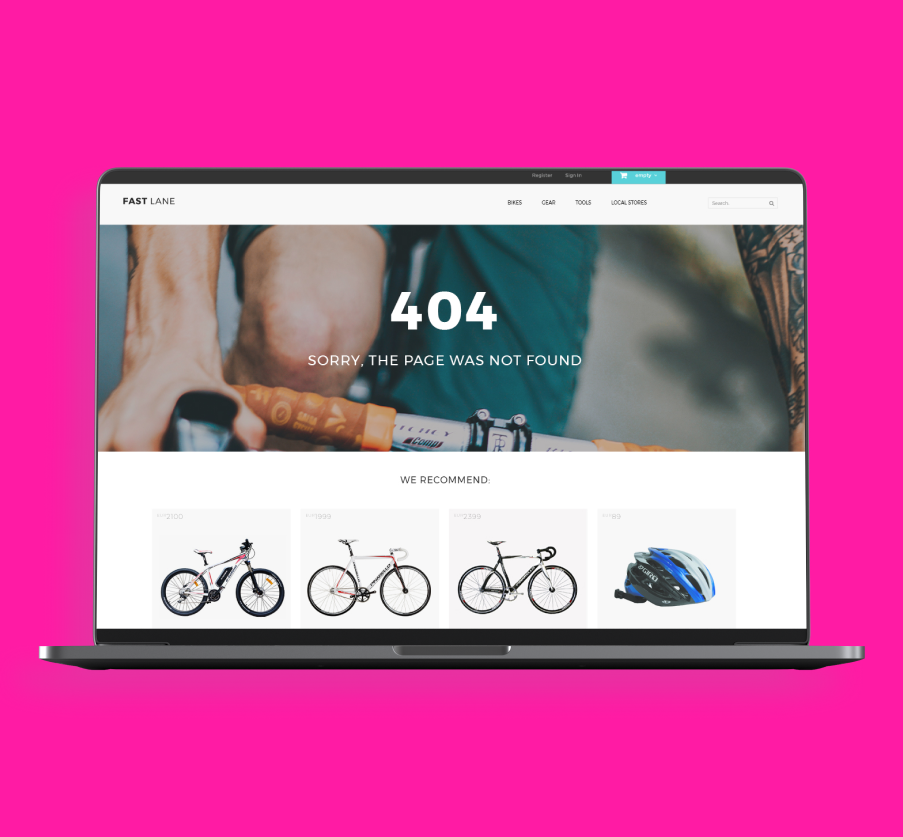
Chances are, if someone is accessing the site from an expired link, you won’t have browsing history data to be able to populate a personalized recommendation. However, using fallbacks to overcome this issue, and best-sellers are a good place to start:
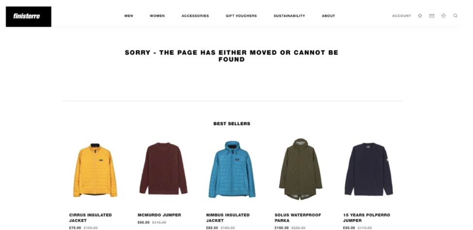
Best sellers can also be featured to drive the shopper towards products that are most likely to increase conversion:
8. Pop-ups
With behavioral targeting options far more specific than ever before, the once shunned pop-up is now more relevant, more personal, and more effective for ecommerce brands. There are many ways to leverage a pop-up: from enticing hesitant shoppers with a time-limited discount to encouraging email capture to allow for further marketing. One especially useful way to make the most of a pop-up is to use them to display in-your-face product recommendations at the most crucial times.
If a shopper is about to exit your site, entice them with visitors with an exit pop-up including products they may have browsed or undiscovered items they may be interested in according to their browsing history.
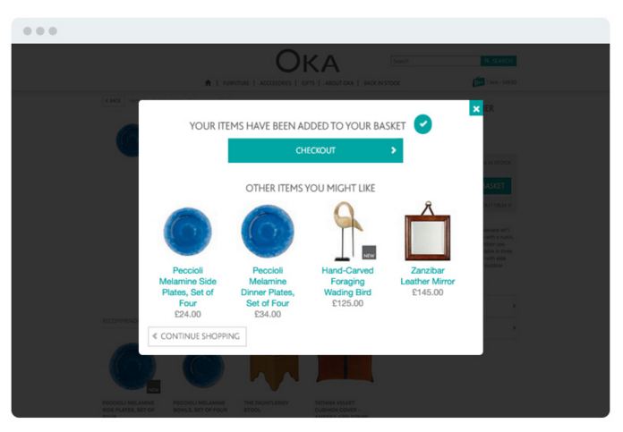
OKA Direct displays product recommendations on the Cart page via a pop-up that is triggered when a shopper adds a product to their cart:
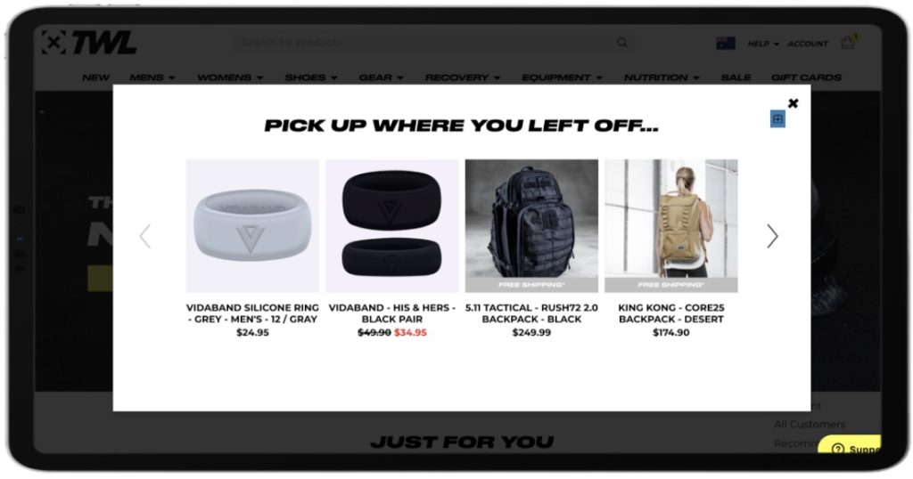
The WOD Life uses abandoned cart popups to re-engage visitors when they return to the site. A popup ‘Pick up where you left off’ shows the products left in cart to remind customers of their last site visit.
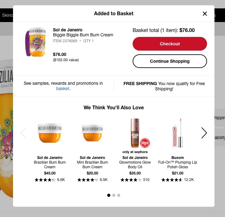
Sephora’s strategy includes the addition of a ‘free shipping’ message to excite the shopper:
Want to learn more about the benefits of pop-ups? Explore additional ecommerce pop-up use cases you can use across your site.
9. Email Marketing
A well thought-out customer experience does not and after the shopper has left your site– whether they’ve left due to indecision or have already made a purchase. Instead, take advantage of other channels – like your email marketing strategy – by incorporating relevant recommendations that leverage behavioral cues. The result: more timely, relevant emails that increase engagement and lead customers back to your site.
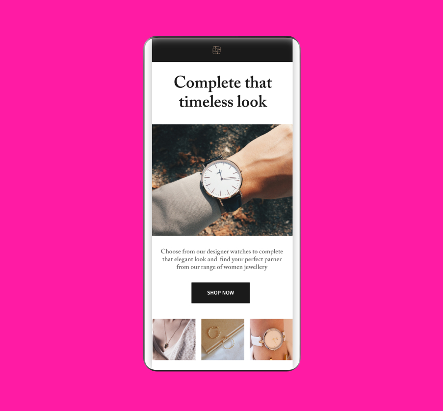
Draw shoppers back to your store with product recommendations based on their previous shopping behavior. These recommendations can be seamlessly integrated into your email templates:
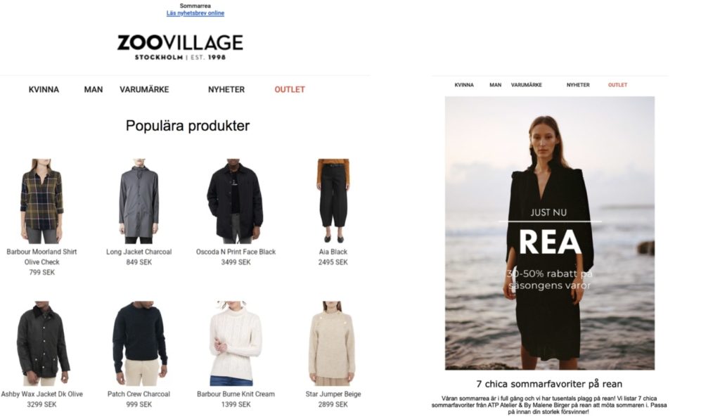
For Zoovillage, email is one of the brand’s most successful channels for ecommerce sales. The products displayed in their email campaigns are dynamic, meaning that they change according to shoppers’ previous behavior on the site, or show which products are trending on Zoovillage’s site at that current moment. This has led to a 15% increase in views on recommended products and a 20% increase in sales:
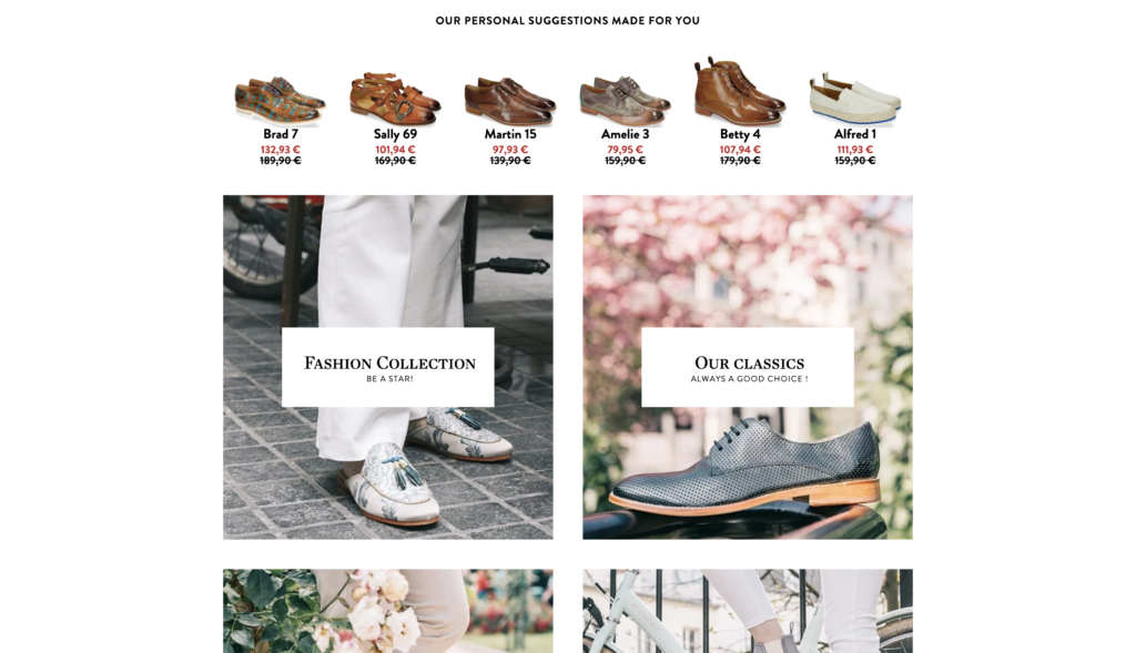
Melvin & Hamilton utilizes recommendations titled ‘Personal suggestions made for you’ in their emails in order to encourage additional purchases:
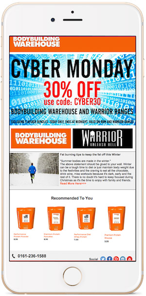
Similarly, Bodybuilding Warehouse incorporates a slot for a ‘Recommended to you’ products to push their Black Friday marketing efforts:
Get Started With These and Other Product Recommendation Examples
Getting started with product recommendations is fairly simple – and with the right tactics in place, you can completely transform the way customers interact with your brand, increase conversion and average order value and attract longtime customers. Nosto’s ecommerce experts are happy to help you get most out of your product recommendations and meet your specific business goals. Reach out to us today for a 1:1 chat and start setting up for the year ahead.

