How to craft a kick-ass ecommerce cart page
The cart page – the destination to which all your previous efforts have been directed. You’ve created an enticing and easy to navigate home page and made sure your product page is fair, representative and encourages your customers to journey further into your site. And it’s paid off- there are items in the cart and, if all goes to plan, your shopper is about to cross the finishing line and head off into the virtual sunset with some of your wonderful goodies under their arm…
But that’s a big if isn’t it? Become complacent now and you risk falling at the last hurdle. And failure doesn’t just look like a cart abandoner (although that, of course, is the worst case scenario)- it can also mean that you have failed to take all the opportunities that are presented at this stage in the journey, optimizing the experience for your business and for your potential customer.
With that in mind we shall look at the the best practices for this page in two sections – first, how to drive customers towards the checkout, and secondly how to use this page to optimize conversion and average order value
Part I: Removing barriers to purchase
Craft the perfect cart contents summary:
First things first, before people go on to buy anything they want to be sure of what they are buying. Allow them to see everything they have selected quickly and clearly by using high quality product images, reinforced with an outline of key details such as size, colour and quantity- along with options to remove or update quantities in their cart. This is much more preferable than forcing them back to the product pages for extra information and order changes, as this essentially takes them a step back in the journey and further away from your goal. That said, if they do want to do a fuller review you need to make it easy for them to do so to avoid them getting frustrated and leaving all together. With this in mind, make sure the product titles in the cart also work as a link back to the individual product pages.
Highlighting brand information or special details such an item being limited edition with a logo or ribbon is a good tactic, especially in fashion, as it adds extra perceived value to the purchase, tempting the customer to go on to buy.
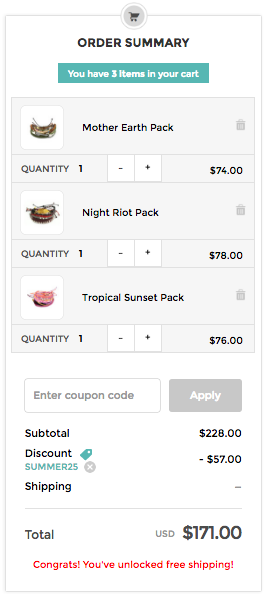
Once people are happy with what’ve they’ve got they are going to want to know how much it is going to cost – make sure to list individual item prices, as well as the all-important total. If there are extra costs (tax, packaging, insurance) then make sure to outline these clearly too. 28% of shoppers abandon their shopping cart if presented with unexpected shipping costs.
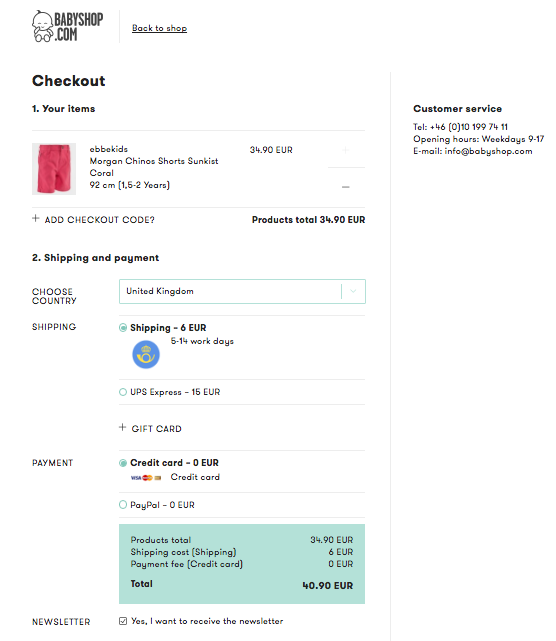
Babyshop give a clear, itemized cost summary with individual costs outlined.
While extra costs can be a turn off, when they can’t be avoided transparency will do a lot to negate their effects. Alternatively, if you are taking away additional costs make sure the savings are listed so people can be motivated by them, for example using a “You save” section in your virtual itemised cart bill.
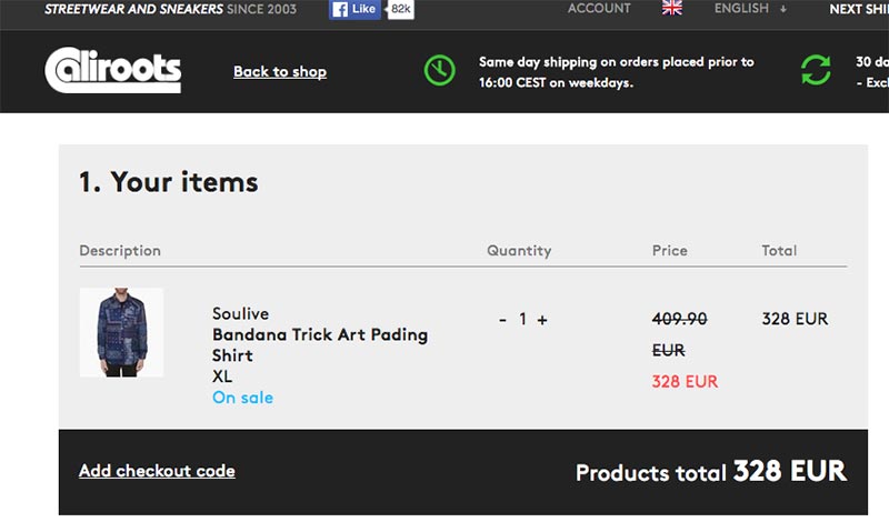
Caliroots make sure to reiterate the saving the customer is making by crossing out the orignal price and highlighting the new price in red.
Be clear with delivery schedule and details:
Delivery time, shipping and returns options are all large factors in a person’s decision to buy. Your first defence against the effect they can have on your conversion should be a policy that is both fair and attractive to your customer. But the quickest, cheapest delivery in the world isn’t going to help convince them to make the jump if they don’t know about it. It should, of course, be communicated throughout the customer journey but the cart page particularly is one place where this detail really needs to hit home. Consider the following;
- It should be immediately clear what options you offer for delivery, including price differences and the expected delivery date for each. If there is a time restriction for certain options, for example same-day dispatch, then consider using a countdown to create scarcity and motivate them to check-out quicker.
- International customers might still be wondering if you ship to their country. Rather than making them wait to fill in their details and find out at at check-out, it is worth having an IP-address based statement which reassures them that this is the case.
- If they’re eligible for free shopping make that clear. If they need to take further steps to be eligible, perhaps reaching a certain cart total, then makes those steps clear. For example, calculate and show just how much they have left to spend (more on this later).
- Reiterate your returns policy. As we have mentioned, if you have a good returns policy you should be shouting about it from the beginning but make sure to boldly state it here too. The most important things are clear and concise language, jargon has no place here and if there are T&Cs make sure to link out to a page where there is more detail.
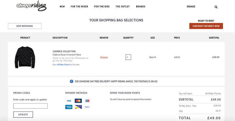
Always Riding are a good example of a cart page done right- with a cheerful reminder of their free postage offer and a detailed countdown for their daily dispatch cut-off, combined with a delivery date promise.
State your payment options and show that they are secure:
A book could be written on payment methods and their importance in digital shopping (in fact, it has- check out…) but as you only signed up to read a blog post what I will say is that whatever you choose to offer make sure all options are clearly presented, from PayPal to online banking and cash on delivery. And once you’ve told them what you offer, make sure to reassure them that these options are secure- 13% of shoppers abandon carts due to payment security concerns, something that is especially an issue for lesser-known brands. Security certificates and trusted shop-badges will help support this aim, so give them prominent position!
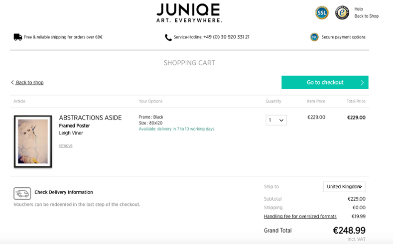
Juniqe clearly label themselves as a secure payment option, giving prominent position to their security certificates.
Use multiple CTA-buttons:
The CTA, the holy grail of any ecommerce page and of even more importance so close to the end of the customer journey, which is why there are a number of things to take into account:
- If your shopper has been on a spree (and let’s hope they have!) your cart page could end up being a long one- if this is the case prevent unnecessary scrolling by having multiple “proceed to checkout” buttons, one at the top and one at the bottom. Also differentiate them from the rest of the page by using clear, contrasting colours.
- Make sure you CTA button’s text/description clearly states what happens after clicking it, for example ‘proceed to checkout’ as opposed to ‘buy’- it is a small difference that may seem insignificant but it can make for a jarring UX if a customer thinks they are done, only to find extra steps on the next page.
If possible, and in line with your brand, funny and personal text is a nice touch and distracts from the fact that this is a purely mercenary transaction, reminding customers why they should want the products in the first place. The text should also contain a verb to represent and inspire action.
Another nice element of the Always Riding cart page is their combining of serious CTA “Checkout securely” (which reassures the customer that their money is safe) with a light-hearted “Ready To Ride?”. The latter reminding customers of open roads and wind in their hair, rather than money leaving their bank account.
Allow them to take money off their total:
When surveyed 30.9% of retailers said that they found a percentage discount was the most effective customer incentive. If you have given shoppers the chance to save some precious pennies, it should be easy for them to do so – otherwise you risk their pleasure at receiving money off being replaced with frustrations over bad UX. Have a discount code box, clearly labeled- with instant updates made to the cart value.
Pura Vida clearly label the area to apply coupon codes, then showing what discount has been applied, the ammount deducted and the new total.
Offer live chat:
Ideally, if you have done everything listed above then your customers should have all the info they want and need to make their purchase. But people, products, websites and business are all unpredictable and there is a chance that there may be something else they need or want to know. In which case, you want to them to be able to ask it and get an answer as quickly as possible so that they can carry on with their journey. To avoid taking them away from the cart page, where they are well placed to make a purchase add a chat service which opens in page. Effectively, this allows your sales representatives to remove any remaining barriers to purchase in real time AND gives the shopper better customer service.
Part II – Optimizing for increased average order value
Ok, so your cart page is optimized for conversion but what about what it could do? For both your business AND your customers.
Remember, if your conversion rate is in-line with the average then less than 3% of people are going to make it here. Once they are you not only want to encourage them to buy what they have, but optimize the opportunity by encouraging them to buy more, increasing your average order value.
We are talking, of course, about suggesting other items from your inventory, allowing your customer to indulge in impulse purchases. Why impulse? On home, category and product pages a customer is still scoping out what you offer and what they are interested in, as well as possibly juggling between options. On the cart page however, they at least think they have everything they need and generally aren’t looking to compare or browse further- which is why items added at this stage will be spontaneous by nature. They should, therefore, be relevant either to the person of the items they are buying to stand a chance of being picked in this, the last chance saloon.
While these items may be selected at the last second however, the difference it could make to your business should not be underestimated. With attracting and converting customers such a costly and time-consuming business, you want to make each one count. If each converting customer adds just a small ticket item to their basket before checking out, increasing your average order value, then the numbers soon add up.
To take advantage of this consider the following;
“Other customers bought”:
Uses crowd logic to highlight what other shoppers purchasing the same items bought. Customer behavior is very telling and when items are bought together it often reflects natural relationships between your products.
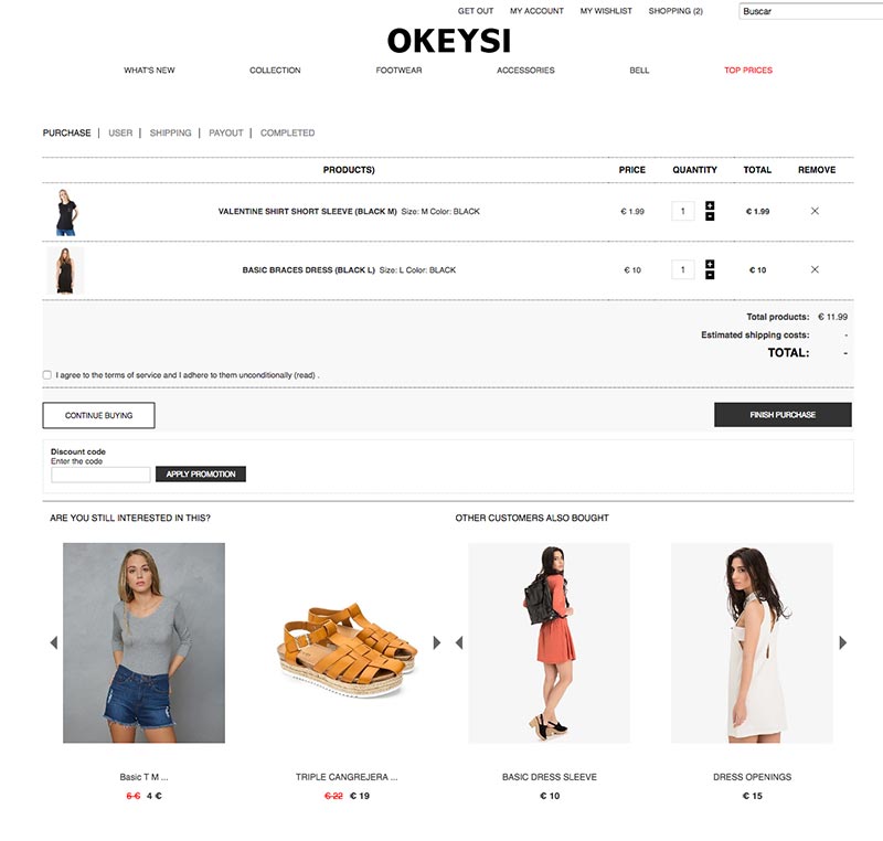
Spanish store Okeysi pair a browsing history recommendation (see below) with a crowd logic based one- showing the shopper which items are seen as complementary to the products they have selected.
Budget options or accessories:
Small-ticket items that complement what a customer is already buying are a quick win. For example, if you sell electrical goods: batteries or power adaptors. This not only maximizes your chances of increasing your AOV but also provides good customer service by ensuring they have everything they need to enjoy their new purchase.
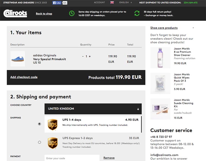
Caliroots suggest small-ticket items relevant to the sneakers in the basket in a vertical recommendation at the side of the page.
Free shipping recommendation:
As we previously mentioned, free shipping can be a big draw for many customers. But with it coming at a cost to your business it may well be the case that you don’t want to offer it until a certain in-cart monetary value is reached. If this is the case, don’t just tell customers what they need to hit a target- help them get there! Calculating how much they have left to go (as discussed in the first part of this blog) is one thing, but what about showing them the items that will bridge that gap? Based on the contents of their cart but with product ranges limited to those which push a customer above the free shipping threshold.
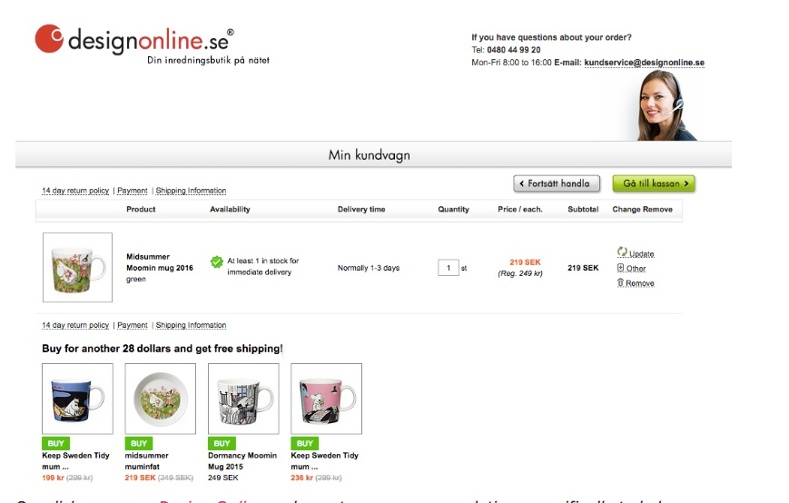
Swedish company Design Online make cart page reccomendations specifically to help customers get free shipping. (Text on image has been translated)
Browsing history reminder:
Use space on the cart page to remind shoppers of items they had previously viewed but not added to cart. This makes it easy for them to rengage with pieces they had forgotten about during their shopping journy.
Junique come straight out and ask if the shoppers has fogotten any products, giving them one last chance to add to cart.
Personalized recommendations:
The cart page is one area in your store especially suited to one-to-one personalization. Why? Because the items that have made it here, into the virtual cart are most in-line with your customers buying preferences. This information is invaluable and puts you in the best possible position to recommend items that are most likely to convert.
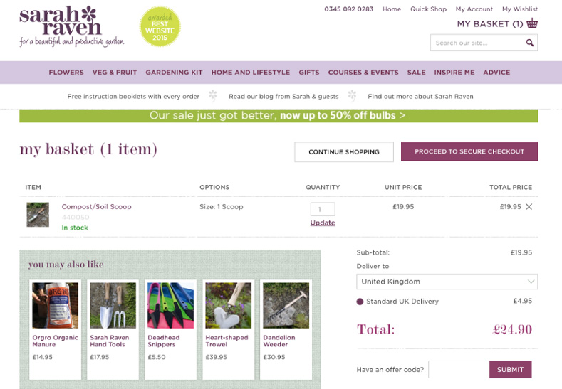
Sarah Raven encourage customers to make further purchases with personalized recommendations based on the interests they have demonstrated.
The cart page is a place of great promise and great opportunity – there may be a lot to lose but there is even more for the taking. Hopefully these tips will give you what you need to do just that.