The Best Ecommerce Pop-ups: 13 Clever Use Cases
In this article, uncover 13 ecommerce pop-up examples that reduce bounce rate, increase conversion and beef up your email capture efforts.
Ah, the ecommerce pop-up: a once much maligned feature of the internet – destined, it seemed, to be banished from our screen.
But the pop-up, like double denim and novelty facial hair, has seen an unlikely comeback. It’s proved itself to be a key tool in ecommerce by driving increases in conversion by up to 44%.
With behavioral targeting options far more specific than ever before, they are now more relevant, more personal and more effective. So, whether you are enticing hesitant shoppers with a time-limited discount, or encouraging email capture to allow for further marketing, one thing is for sure: the humble pop-up is back and it is here to stay.
Let’s look at thirteen ways to embrace pop-ups in your ecommerce store.
1. Greet New Customers and Collect Valuable Email Addresses
Some say bribery, we say incentive. Whatever you call it, one way to encourage visitors to your site to leave their email addresses behind is by offering them a discount in return. They get money off their order and you inspire action, as well capturing potential shoppers’ details. It’s a win win. But remember, this type of pop-up is best set to appear to new visitors – preventing discounts being given for old email addresses.
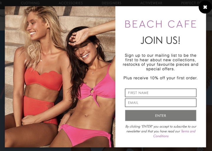
Fashion retailer Beach Club offers new visitors 10% off their first purchase in exchange for a newsletter subscription. By doing this they increase the likelihood of purchase and pave the way for marketing at a later date through retargeting emails.
Bonus tip: To really maximize the value you generate from these shoppers, consider setting up personalized triggered emails to engage with your customers offsite. Check out how you can build the ideal product recommendation email strategy.
2. Generate a Sense of Urgency to Boost Season Sales
As most of us will remember from school, there isn’t much that will get people moving like a looming deadline. The same applies to ecommerce- and a pop-up is the perfect vehicle to deliver it.
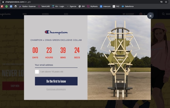
Fashion brand Champion is one store that made excellent use of this – using a countdown timer to generate hype around one of their clothing ‘drops’ and encourage shoppers to sign up for updates on upcoming releases. When the pop-up was minimized, the countdown appeared in the corner of the screen to keep it top of mind with customers as they browsed the site.
3. Push Specific Items Based on Seasonality/Necessity
Whether you’re selling an essential product that you know your shoppers will need, or an item that is relevant to shoppers based on location, seasonality, or other attributes, using a pop-up to promote them helps drive the message home.
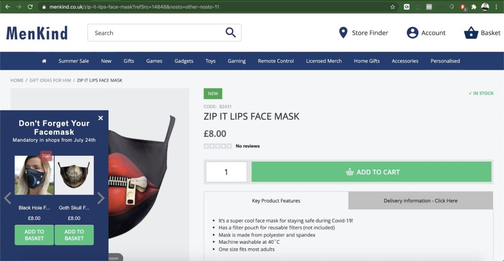
For example, during where face masks are the ultimate (and a necessary) accessory. Men Kind used a subtle pop-up to spread the message of mandatory face mask alongside two mask options for the shopper to purchase (including convenient ‘add to cart’ buttons under each item).
4. Offer a Discount or Freebie on Cart Pages
A discount or freebie is all well and good, and no doubt a powerful tool but sometimes it is even better if you can make it work to achieve more than just a simple conversion.
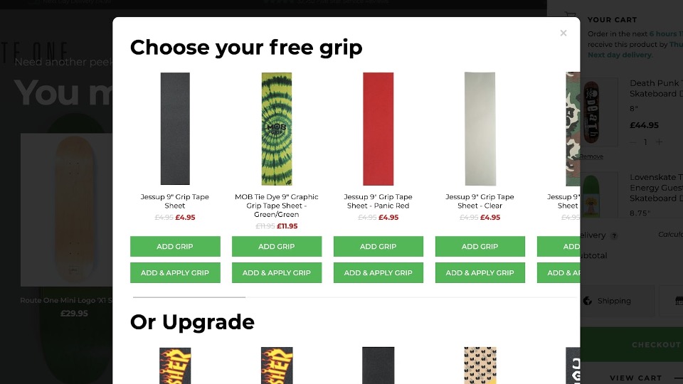
This is exactly what Route One did by using their pop-up to entice customers to increase their cart value. By offering free grip or product upgrade to customers who purchase a skateboard, they effectively encouraged those customers to add a couple more items to their cart to drive up-sell and order value (or even enjoy a fun freebie!)
Alternatively, if you are more concerned with encouraging those shoppers who are already big spenders to make it to the check-out then you can set your pop-ups to be triggered by cart value. This ensures that you only offer discounts to those people who have a cart of substantial monetary value.
5. Launch a Flash Sale to Get Shoppers in the Mood
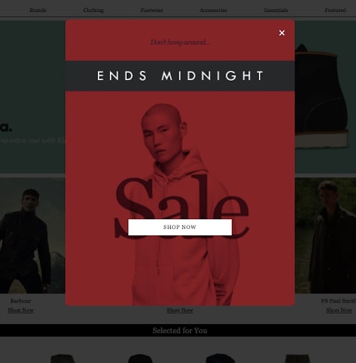
Nothing gets your customer’s heart pumping like a good old flash sale. Because these sales are typically only available for a limited window of time, a pop-up is the perfect way to make sure your customers are aware it’s happening.
Woodhouse Clothing masters the art of flash sale promotion by using a sleek and simple pop-up design to get the message across:
6. Send Important Messages to Your Site Visitors and Ensure They’re Top of Mind
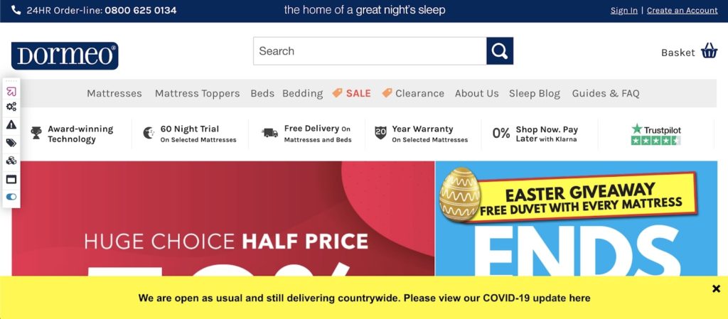
Pop-ups don’t always have to promote certain products; sometimes they can simply be used to communicate an important message with your visitors.
A prime example of this: Dormeo uses of a pop-up on their homepage to offer delivery info updates during the global pandemic. This is a key way to let shoppers know you’re still open for business and also remain transparent if you come across any shipping delays.
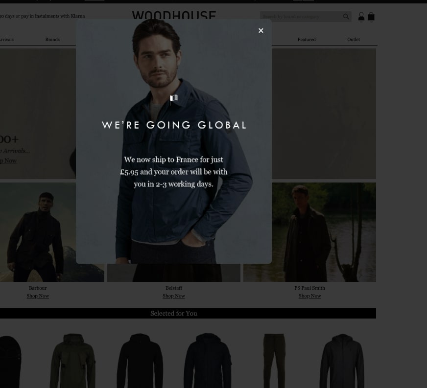
Woodhouse Clothing displays pop-ups specific to a shopper’s geo-location to let them know that the brand ships to their area (as well as how long it would take to deliver):
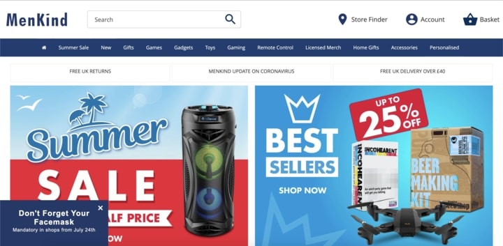
If you do choose to mix in some product recommendations, you can still do so without actually showing products. In our earlier example from Men Kind, we showed how they promote face mask sales through a subtle pop-up. In this example, they chose to forgo product promo and offer a simple reminder to shoppers that masks are still mandatory:
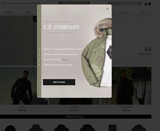
If you prefer to offer a more simple, brand-specific message once a shoppers enters the site, you can also take a page from Woodhouse Clothing‘s book and list out a few reasons why your customers can trust in you to find what they’re looking for:
7. Offer Complementary Items Before Checkout to Increase AOV
Pop-ups don’t just have to be used for discounts and email capture (although as we have seen they are great for both of those purposes), they can also be used for product recommendations.
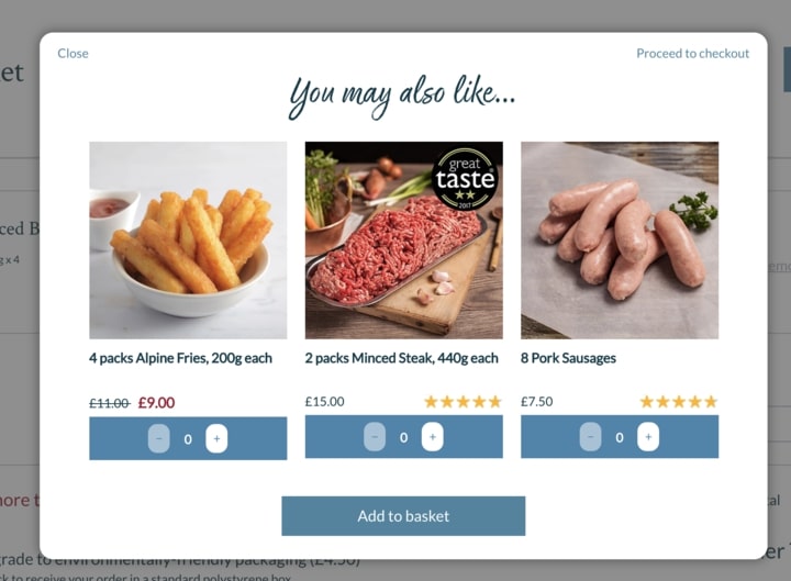
Donald Russell do this to great effect with a pop-up that appears when a customer has added something to their cart. Instead of just confirmation text, they use the pop-up real estate to recommend complementary items. This allows the customer to discover relevant items without disrupting their journey and encourage cross-sell.
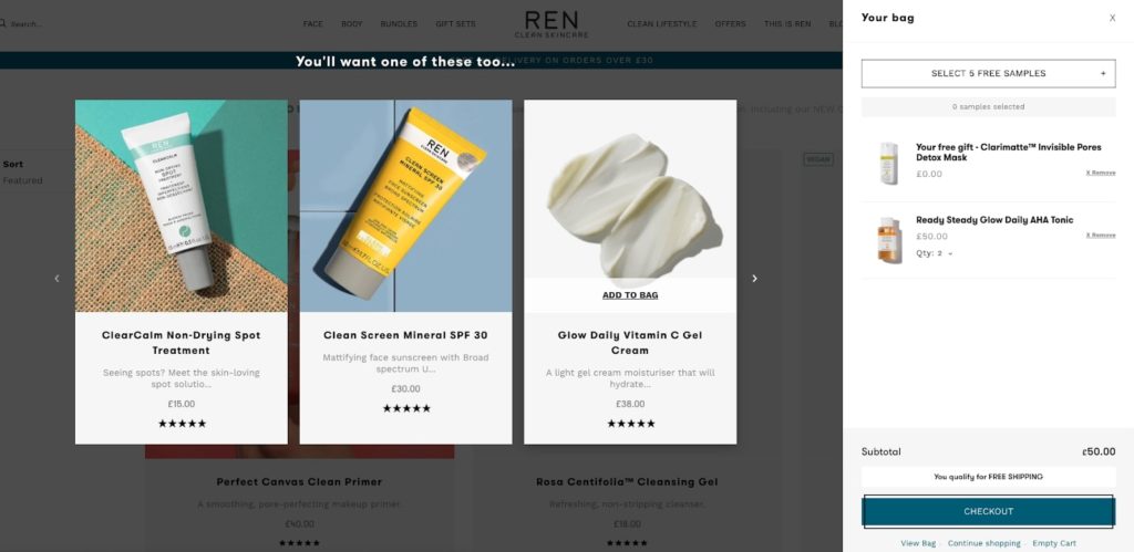
Similarly, REN Skincare uses a slick design to recommend additional products once a customer has added to cart:
8. Help Shoppers ‘Complete the Look’ With Cart Pop-up Bundles
An alternative to increasing cross-sell with ecommerce pop-ups is to guide shoppers towards items that are typically purchased with the ones they’re already interested in. Product bundles encourage customers to add more items to their cart while also discovering complementary items they probably wouldn’t have come across on their own.
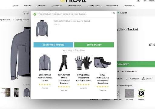
Proviz Sports promotes product bundles in a pop-up on the PDPs of products in order to increase conversion rate for those products:
9. Re-engage Returning Visitors Who Have Yet to Make a Purchase
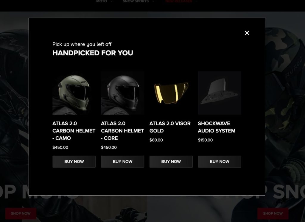
Whether it’s indecision or simple distraction, it’s always good to remind returning visitors of the things they’ve previously browsed in order to spark some inspiration to purchase. Plus, making it as easy as possible for them to pick up where they last left off is a plus in guiding them towards checkout faster.
In this example from Ruroc, the brand uses a pop-up that appears when a visitors returns to the website and uses their past browsing data to showcase items they’ve already browsed or similar selections.
10. Convert Shoppers Before They Exit Category Pages
Site abandonment is never a good thing but that isn’t to say that can’t turn this negative event into a positive opportunity for your business. The Category page, in particular, is a hot spot for shopper engagement; up to 70% of online sales generate from this page, so it’s key to make the most of this real estate so your customers don’t bounce.
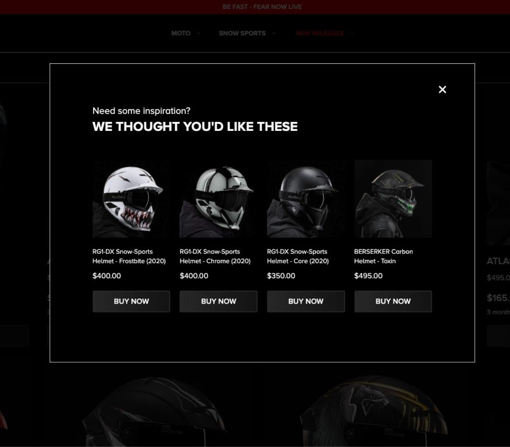
Select a trigger that targets abandoning shoppers with an intent to leave a given category page and display products that they might not have discovered yet, but may like.
Ruroc do exactly this by re-engaging customers that are about to leave a Category page with an exit pop-up that displays products they might enjoy. These products are selected based on the ‘Browsing History Related’ algorithm.
11. Offer a Cart Contents Reminder
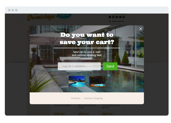
With the global average for abandoned cart rates now almost hitting 70%, it is essential for online retailers to directly target customers who are leaving without completing their purchase. This is a similar concept to the site abandonment pop-up discussed in the last example but looks specifically to target customers that have actively engaged by adding items to their cart.
Greatdays have implemented this style of pop-up- targeting abandoning unidentified shoppers with an offer to saves their cart contents. This allows them to reach out through email with a reminder of what they had shown interest in. The shopper is then able to continue their shopping at a more convenient time and Greatdays can store their email address for further retargeting purposes.
12. Reveal a Discount Code in a Pop-up Shown to a Specific Segment of Shoppers
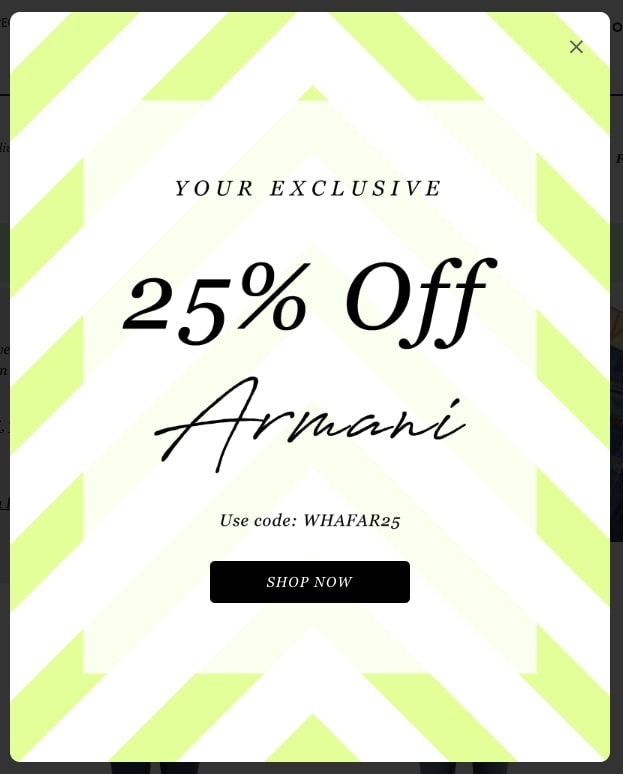
While discount codes are a great incentive to get shoppers through the door and towards checkout, sometimes you want to treat certain shoppers (like your VIPs or those who have affinities for specific brands) to a percentage off their next order.
Online, this can be achieved through ecommerce smart segmentation, which allows you to target a specific audience with a specific message or product – or in this case, a discount.
Woodhouse Clothing display a pop-up containing a special coupon code for shoppers that fall within a certain brand segment, which helps them promote those brands further while treating those who show the most interest in them.
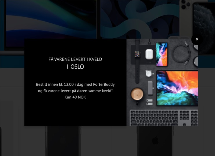
Eplehuset create hyper-personalized interactions on a local level by displaying a special pop-up message to shoppers who fall within a specific location segment. In this example, they offer special messaging for shoppers located in Oslo, Norway:
13. Make the most of PPC campaigns for increased ROAS
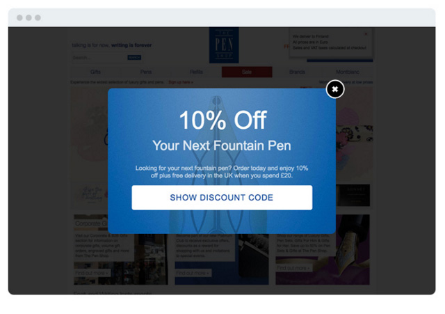
When traffic comes to your website through a paid route you want to make sure that you are making as much of that opportunity as possible. One way to do this is by displaying a pop-up exclusively on the the pages PPC acquired shoppers will land on. The Pen Shop is optimizing for exactly this by using a pop-up triggered by the relevant url-parameter. When this is clicked to bring a customer to the store the pop-up appears, incentivising them to make a purchase and aiding the ROAS from that channel! This can be done for other channels and campaigns also – for example traffic coming from Facebook ads, newsletters, blog posts or other content sites.
Eager to Expand Your Strategy Beyond Pop-ups?
These 12 ecommerce pop-up examples are sure to boost your business, but they’re only one of the many ways you can create a personalized your customers will remember you for. Transform your 2021 ecommerce sales by implementing the ultimate product recommendation strategy.

