How to Create the Best Category Page: 8 Steps to Get Inspired
Up to 70% of online sales originate from Category pages, which means every bit of real estate on these pages count towards your success. Learn how to create the ideal Category page to convert more customers and boost your sales.
Ah, the category page – perhaps the most familiar page of the modern ecommerce website, hark as it does back to the days of post-order catalogs. With a structure based on long lists of various products, it’s in some way, a testament to human beings as creatures of habit- resilient to the pull of technology and the possibility of new ways of doing things.
Yet, if you are willing, there is much that can be done digitally to make sure your category page doesn’t end up the same way as your catalog, much ignored and resigned to the trash.
This is a page, that requires consideration before it’s reached – primarily in the way the content is split and then represented in the site’s navigational design. With this in mind, we’ll look at how you first establish your categories and how they should inform your navigation, from which we will go on to concentrate on the features of the page itself.
1. The Ideal Look and Feel of a Category Page Design
Exactly how your page should look is going to depend on your brand and what you sell but here are some useful best practices.
Visual cues
Make it visually clear where a visitor has landed. Category pages are often SEO optimized, as well as paid traffic being driven there – this means a customer may end up on a category page without taking a journey from the homepage.
It’s therefore important to give strong visual cues as to where in the site they have entered. This can include inspirational banners stretching the full width of the page.
These should highlight multiple items to show range and keep the page timely and relevant, for example, if it is summer and you are a clothing retailer pick some of your best-selling summer pieces. Imagery can and should also be bolstered by a descriptive header that details the type of products that will be found there. This also counts towards SEO and should thus be optimized.
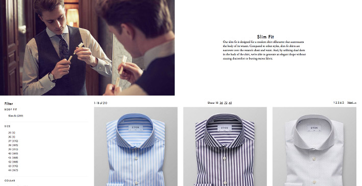
In this category page example, Eton Shirts uses both a large inspirational image and a supporting text to signal what page shoppers have landed on.
Use of columns
Rows are the most used layout in ecommerce, with an average of three items per line. That said, it isn’t a case of one size fits all and should be decided on a category-by-category basis.
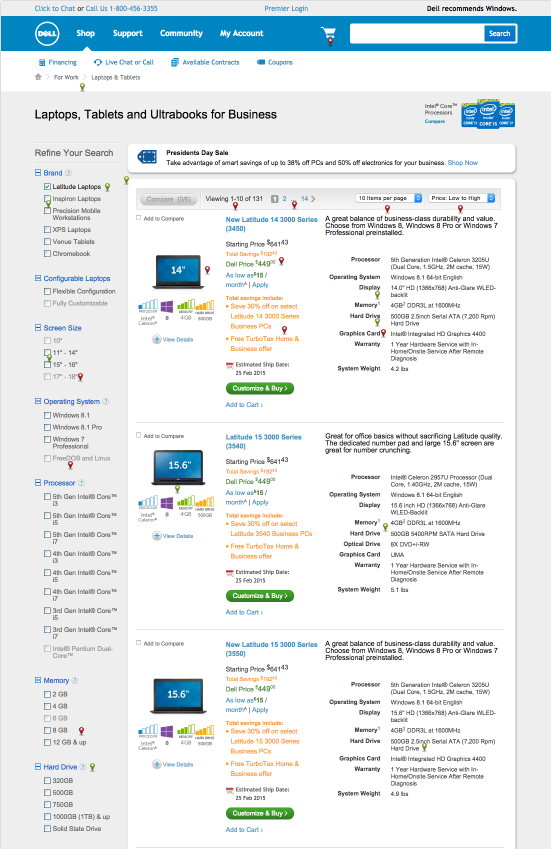
For example, you may want to have just one column, giving each product in the list full width of the screen. This is useful when you have products that by their nature people want to see a lot of information about i.e. computers, as is shown in this category page example from Dell:
It also works well if you have a small category with a number of simple and complementary products that are likely to be bought together, as it allows people to browse them together and select what they want from the category page itself.
2. Automatically sort products based on performance metrics
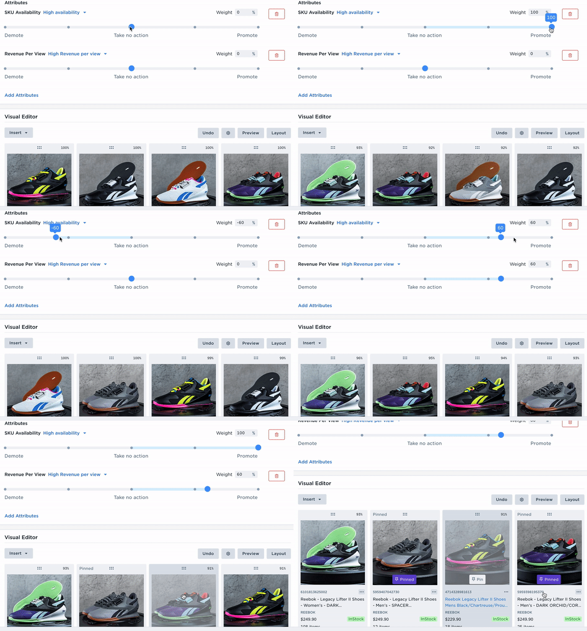
In order to deliver category page experiences that accomplish their merchandising goals, sporting goods retailer The WOD Life implemented category merchandising on their website. To drive more discovery for their new arrivals and increase conversion:
3. Displaying the Most Relevant Filters
One of the primary issues with category pages is the number of items that can be held there. A never-ending list of products is neither appealing or useful to time-poor shoppers who don’t have time to sift through them. This is why filtering is of such key importance, and here are a few tips on getting it right.
Location
Let’s start with where to put them. Broadly speaking there are two popular options that you may want to consider.
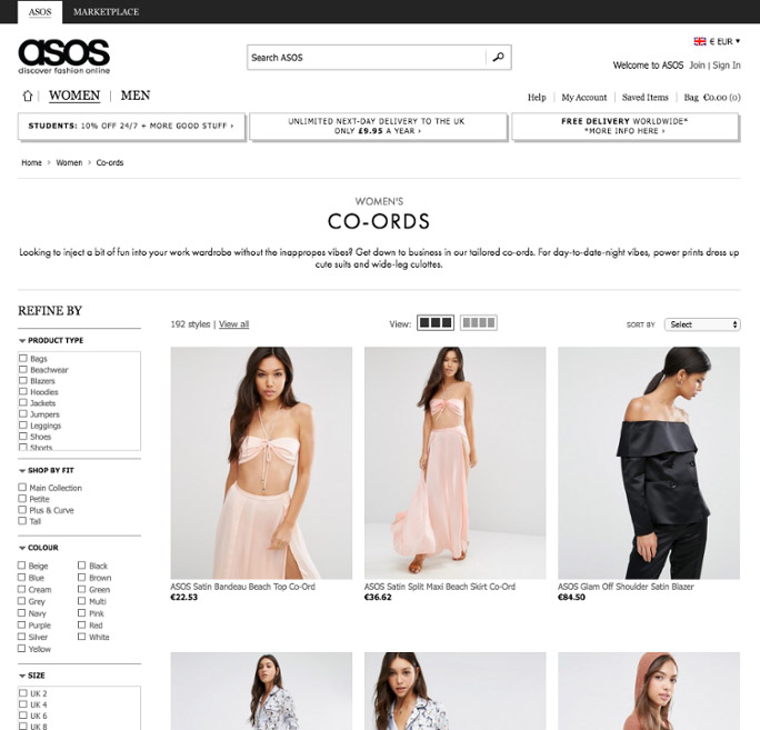
Left-hand navigation was the standard for a long time – keeping with this tradition will avoid a disruptive UX that may be confusing to the shopper. And as we all know, if a shopper finds your site hard to use, they won’t use it. However, studies have found that sometimes tunnel vision and a tendency to focus on the upper center of the page means that users can sometimes not use the filtering options at all, instead confusing the sorting options (normally found in the upper center) as the primary way of trimming the product list. If you do choose to use left-hand filter navigation then reduce the chance of this happening with a notable filter design – i.e checkboxes.
ASOS keep with the more traditional left hand positioning for their filters, using check boxes to make them more obvious.
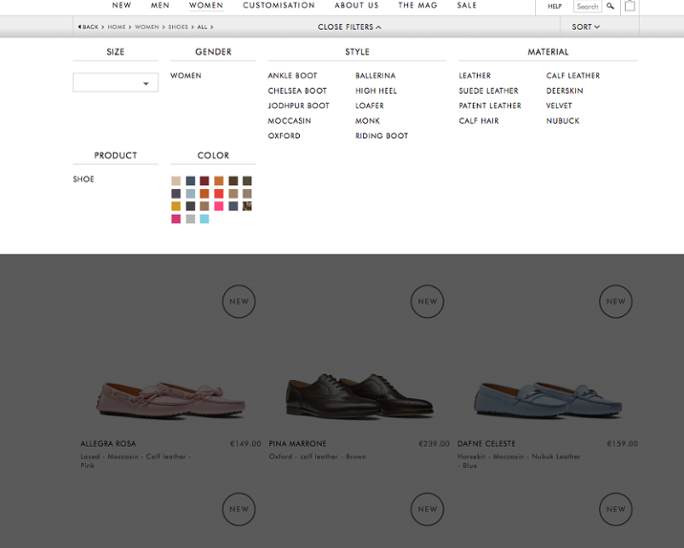
A horizontal toolbar which combines both filters and the sort tool – this has been shown to combat the issues stated above and also allows for larger product photos, however, because of the limitation of a page’s width vs length, this approach only works well for store types that naturally have only a few filters.
Scarosso have both filters and the sort capability at the top of the page.
Ecommerce filter design
In terms of the filters you should have, this will of course depend on what you are selling, but things to keep in mind:
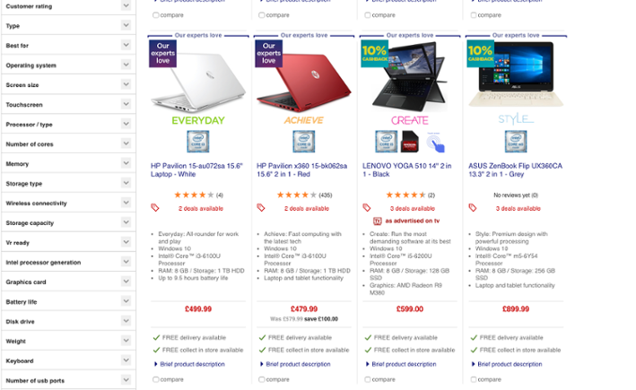
If there are multiple ways of filtering your products then have multiple filters, it is about giving your customers the options they need to find what they want. If you are selling computers then they may be looking for a computer in a certain colors, with a large hard drive AND a large screen. Allow them to layer the options you give them so that they are only left with the products that fit in with their criteria. Serving someone relevant products means they are more likely to buy.
Currys give an extensive range of filtering options:
You should know your customers more than anyone else – use this inside knowledge to know what might be useful to them, that others might not think to include. For example, as a woman’s clothing retailer you may know from target market research that many women are not comfortable wearing tops without sleeves. You should then add a “long sleeve” filter option to your style filters on the category page for tops.
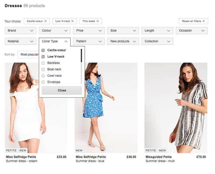
Zalando has added some very specific filter types that other fashion retailers do not have, such as collar type:
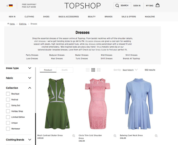
If your business is prone to seasonal change then add temporary and timely filters- for example, if you are a clothing company and it is summer then you know that a lot of people are shopping for their holiday – why not add a “holiday” option to the look-book style filters to save them time?
TopShop adds filters such as “Festival” and “Holiday Shop” to their dress section:
4. Sorting Options
We have already touched on sorting in the last section, as something that is complimentary to filtering and can even be combined. However, it is worth noting that, especially if you are using a left-hand navigation, this is a must. Customers may have whittled down the items they want to see, but now the order in which they want to see them becomes paramount. While it will depend on your business, the most common are factors such as price, rating, and popularity.
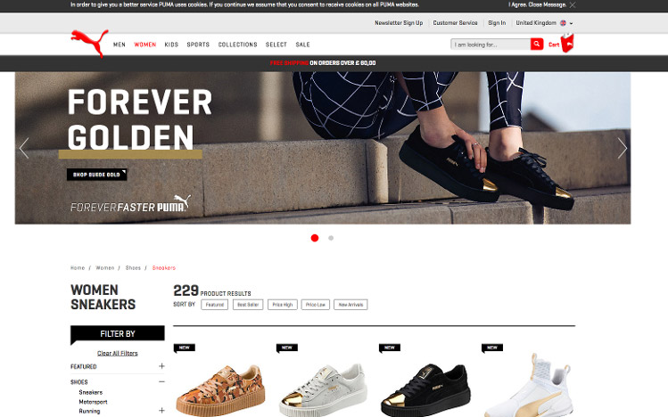
Puma, for example, uses multiple sort options:
However, if you really want to go above and beyond, then dynamic and personalized sorting is the holy grail. This means you automatically adjust the product order for each user separately based on their browsing & shopping history, cart content, and merchandising rules, offering a truly personalized and relevant experience.
For example, if someone shopped for Nike sneakers in the past, show the new Nike models higher up in the list. If they have searched for a specific brand, then highlight that brand on every category during that visit. It is better for your customer and better for you.
5. Customer Segmentation
Real-time segmentation can satisfy a number of use cases: from influencing life cycle stages (e.g. showing more offers for new users and new items in stock for returning customers) or improving relevance based on previous engagement or transactional history (e.g showing more Adidas products to those interested in the Adidas brand).
Here are a few of the many ways you can deploy segmentation on category pages to increase the quality of each interaction:
First-time visitors
First impressions are always important, and because first-time visitors are still getting to know you (and vice versa), expose these shoppers to the products that convert best on your site whenever they will visit those respective categories. This tactic not only opens the door to product discovery, but it also helps steer these customers toward products that typically move the needle.
Not sure where to start? Check out how to set up a sequence for first-time visitors using Nosto’s Category Merchandising to increase product discovery.
Loyal customers
In online retail, the first purchase is the perfect moment to start building a relationship that goes beyond a computer screen.
From unboxing experiences that incorporate free samples to leveraging social media content, brand hashtags, personalized notes, and rewards for customers, a wide range of strategies exist to start building loyalty. Some ways you can cater to loyal customers on your category pages include:
- Using past information to recommend relevant products
- Sorting by margin to increase profitability
- Optimizing your page setup for the best performance
Want to see these tips in action? Learn how to use personalized category pages to pamper your most loyal customers.
Affinity segments
Say you’re a multi-brand sports retailer who wants to target shoppers who have an affinity for Nike products. Promoting Nike products sounds like a relevant move. However, promoting similar brands such as Jordan, Hurley or Nike ACG may also be relevant, as it has been discovered that a large majority of shoppers who interact with Nike also interact with those brands.
Creating affinity segments ensures you display the right products, campaigns, and content where it will resonate most. When building this strategy, you can give weight to a particular brand within the category page to influence where they’re displayed on the page (e.g. showing Nike first, followed by Hurley and Jordan).
See how it’s done: Get a first-hand look at how we use customer insights to create segments according to customer affinities.
UTM tags
Ecommerce conversion rates average at or below 3% while paid media CPCs are on the rise globally – which means squeezing the most out of each visit is paramount for increasing conversion.
Many retailers are diligent about utilizing UTM tags (e.g. the parameters like “utm_source” found after the question mark in a URL) for tracking both paid and organic campaigns for analysis later in web analytics programs like Google Analytics. However, they’re also great for delivering more sophisticated experiences that can drive more users to your category pages.
Once you understand where your traffic is coming from, you can personalize your category page to reflect content that your shoppers are most interested in seeing based on where they came from. This can be done by creating a segment of users that visit your site via a specific UTM campaign.
See how it’s done: Follow our step-by-step guide to use UTM tags to segment your customers.
Geo-location
Online retailers who expand into multiple continents and individual countries will (or should, at least) eventually start to modify the experience to be more localized. This usually involves localizing by language, offering local payment options and currencies, and calculating localized shipping information.
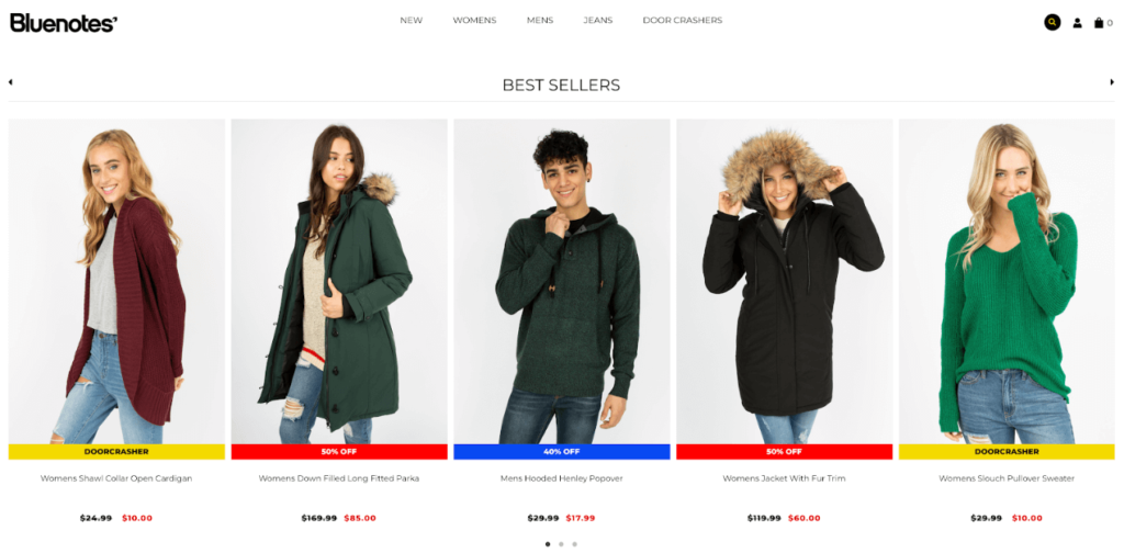
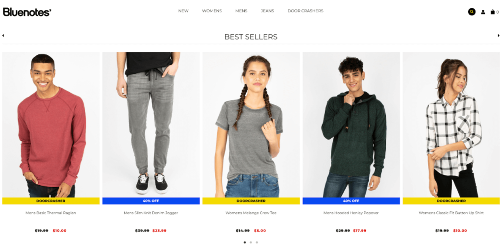
Canadian fashion retailer Bluenotes sells their products to US customers and the difference between New York and California is uncanny.
The below example shows what a customer in New York would see in November. We can see a clear trend towards winter clothing with a couple of warm parka jackets signaling the oncoming winter temperatures:
Meanwhile, a customer in Los Angeles will see a combination of warm clothing options and short-sleeve t-shirts:
Continue reading: Learn how to promote your best selling products by geo-location.
6. Increasing Conversion on Your Category Pages
About 70% of sales happen on the category page, so you’ll want to make sure it’s as optimized as possible to keep the conversions flowing and prevent your shoppers from bouncing off the page (and your website). Here are some of the many optimization tricks you can implement to make this experience as relevant and helpful as possible.
Facilitate product discovery for first-time customers
Category listing pages are the supermarket aisle signs of digital retail. These signs make it easy for you to identify which aisles you need to visit to find the products you need, which saves you from having to wander around the supermarket aimlessly.
In digital commerce, similar challenges apply – but with a higher likelihood that first-time visitors who can’t find the right product(s) effortlessly will exit your site.
Retailers invest a lot to set up a powerful search engine, relevant product taxonomy and implement intuitive filters and faceting or offer various sorting options – but it’s nearly impossible to get a product selection right for each single shopper at the first impression.
To maximize the probability of conversion for all shoppers visiting an online store for the first time, Nosto recommends taking advantage of performance metrics and sorting products based on their individual conversion performance.
Want to learn how? Learn more about how to facilitate product discovery for first-time visitors with popular and discounted merchandise.
Optimize the category page with product recommendations
Optimizing the category page experience to account for previous behavior and interests is a cornerstone in Nosto’s Onsite Product Recommendations. Not only does it alleviate friction in the product discovery phase, but it makes it easier for your shoppers to interact with the products they’re most interested in seeing/buying.
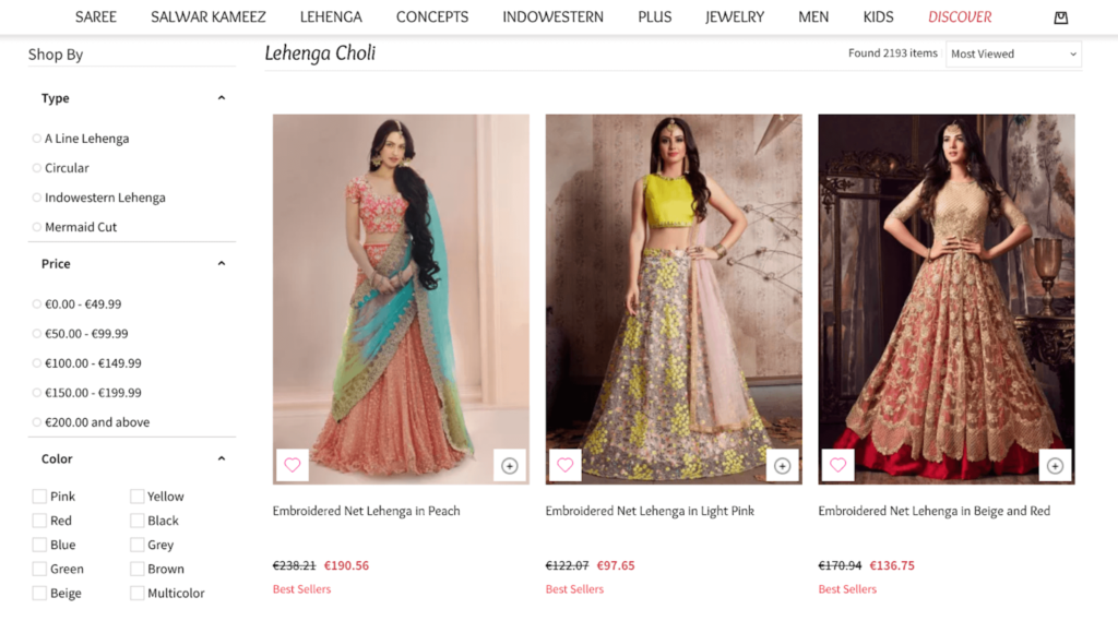
For example, Utsav Fashion leverages a combination of Browsing History Related and Best Sellers coupled with a “Current category” filter:
Want to learn how? Check out how to optimize your category pages with product recommendations.
Leverage ratings and reviews for social validation
There’s very little doubt that social validation – commonly seen as ratings and reviews on ecommerce websites – is a huge influence in driving revenue.
Consequently, this makes ratings and reviews technologies (like Yotpo, Trustpilot, and Bazaarvoice) almost a must-have for any online retailer. As a side note, stores with a fast stock rotation, where ratings and reviews might not yield the same punch, can – and should – use social photography to strengthen the brand itself.
When combined with AI-powered personalization, shoppers can not only discover not only the most relevant products but also those that are the most popular in terms of ratings and reviews. The result: stronger social validation – a key ingredient in a memorable commerce experience.
Want to learn how? Explore the exact ways you can drive revenue in your online store through social validation.
Run A/B tests for the strongest performance
One retailer might be content with improving overall revenue on category pages, while others believe improving margins is the main focus. Whatever your business goal may be, testing is a way to ensure your category page efforts – and overall ecommerce merchandising strategy – is the most effective.
Native A/B testing gives retailers the means to come up with and validate well-informed hypotheses (such as testing the revenue impact of items that convert well vs. promoting new arrivals). From there, you can deploy a live test in minutes, interpret results, and optimize your category pages according to that insight.
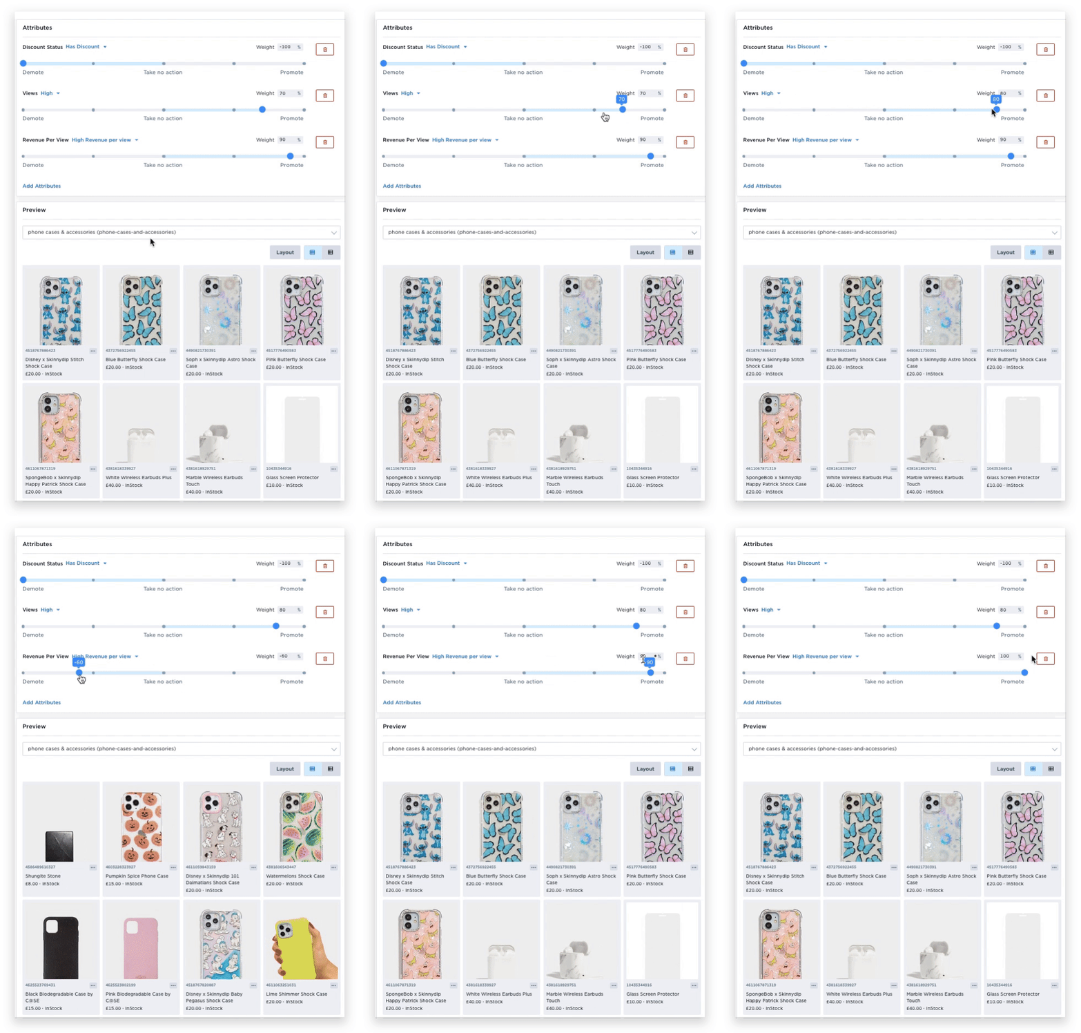
For example, fashion accessories retailer Skinnydip wanted to test the impact of showcasing popular products on their Beauty, Clothing, and Phone Case and Accessories Category pages that yield positive returns in the form of tangible revenue per view.
In this test, new, non-discounted products were prioritized on the respective Category page to maximize AOV and revenue. Meanwhile, discounted items were demoted. This variation was tested against Skinnydip’s default page setup, where new and best-selling products are manually mixed together and “new” products are based on the brand’s assumption of which products would perform well:
Continue reading: Learn how Skinnydip’s A/B test impacted their conversion rate and click-through rate across non-sale categories.
7. Why the Best Ecommerce Category Pages Use Personalization
We’ve already determined that the pure number of items on category pages is often one of the main issues people face on this area of an ecommerce site. And as we’ve seen, filtering and sorting options can be used to combat this.
But they are only of use if a customer knows what they are looking for. What if they they are still in the discovery mode of shopping? Automated product recommendations could be the answer or check one of the many other ecommerce personalization examples there are.
Go for a 1:1 personalization slot if you have enough data on the individual browsing – this will bring the most relevant products for them to the forefront, making the shopping journey quicker and easier for them.
Otherwise Best Seller recommendations are a great option – these will show what items are most popular in the category, automatically highlight the products most likely to convert, showing some range so that they are aware of the type of products that can be found there and also reflecting seasonal and trend based changes.
Sarah Raven use Best Seller product recommendations on their category pages:

8. Infinite Scroll, Pagination and “Load more”
The way to split your products across a number of pages can be a bit of a tricky subject.
On the one hand infinite scroll (the ability to view a whole category on one page) encourages browsing and ultimately exposes users to more products, but without a reason to pause, it has been shown that shoppers end up scanning more and so are less focussed on individual products. This means they are less engaged with each item and when we are less engaged, we are less likely to buy.
Pagination, however, can make the process clunky and leave users feeling frustrated. The answer, according to Baymard Usability tests is the use of “Load more” buttons and with that, lazy-loading. Lazy loading means elements are present, but are not loaded until they are needed. This means that the products appear to be on one longer page, but the natural break “load more” and lazy loading offers means that shoppers are more engaged. It is the best of both worlds.
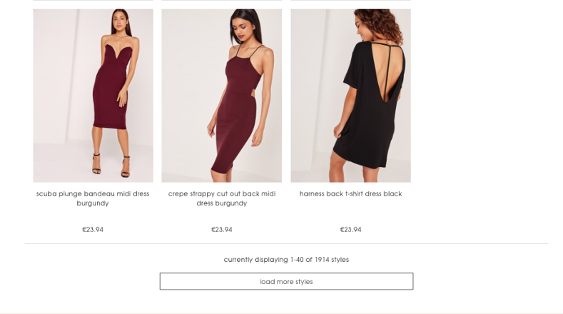
In this example, Missguided have opted for the “Load more” option:
Note: If you do still opt for pagination, give shoppers the option to select how many items they see on each page – this puts the power back in the hands of the shopper and works to somewhat naturally offset the frustration of page loading delays, as they know they have elected to view that many products. Remember to also include all page numbers too so that it is easier for them to return to a certain page.
9. Product Information
Key product information can be crucial in eliciting interest from passing browsers, yet with an area as busy as the category page, with many different products vying for attention, there is a thin line to tread.
Too much information and your viewer could feel overwhelmed, too little and you may find they fail to be enticed any further. It is up to you to decide what is key information in relation to your products but there are general patterns that have been found to work.
In consumer electronics, features such as review stars, bulleted key details, and promo ribbons have all proven popular. In fashion, color, and size options are easily represented in icon form.
If you want to have the best of both world, showing only key information but also giving shoppers the option to delve deeper without clicking through, then consider a pop-up box triggered by the mouse hovering over an option. This can include more details, a video or gif, or an additional image with the product from a different angle or worn by a model.
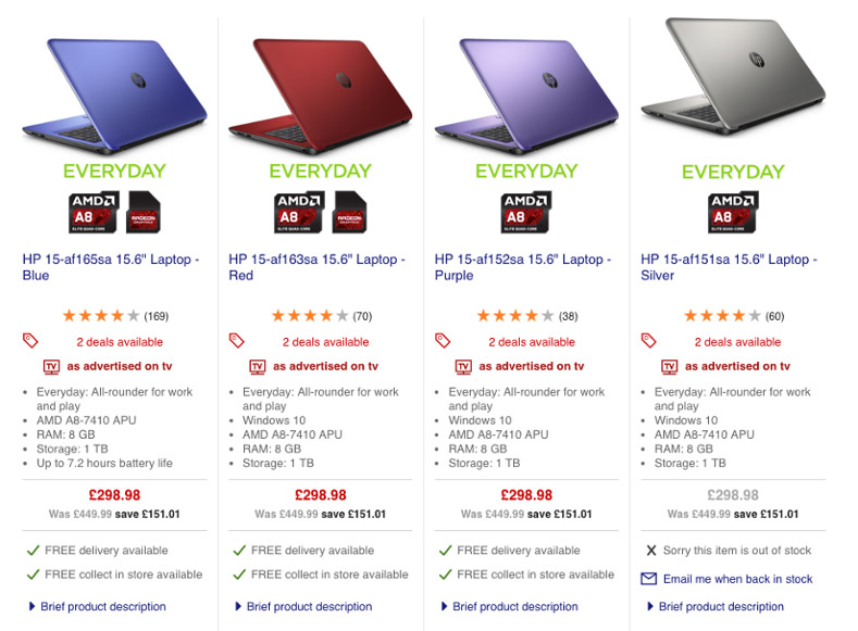
Currys, knowing what’s important to their target market and because of the nature of their products, have quite a large amount of key product info on their category page:
One Page Down, a Whole Site Experience Left to Go
So, there we have it – everything you need to consider to craft a category page that UX dreams are made of. Go forth and categorize!
And after you do, think about how the products you’re displaying impact your customers’ shopping experiences. Are you showcasing the right products on the pages that make the most sense? Are you doing the most to make sure your customers discover new brands and items and interact with (and purchase) the ones that are most relevant to what they’re looking for?
To answer these questions and more, dive into our guide to creating the ideal product recommendation strategy.

